The Lincoln Sentinel
By Jim and Cheryl Farrell
The high-water mark for the Lincoln Town Car was 1988, when 201,113 were sold. By 1995, Ford was still selling over 100,000 Town Cars per year. The last model Town Car was marketed from 1998 through 2011. Although exact figures are not available, Lincoln made a comfortable profit on every Town Car sold.
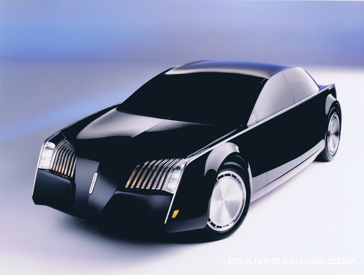
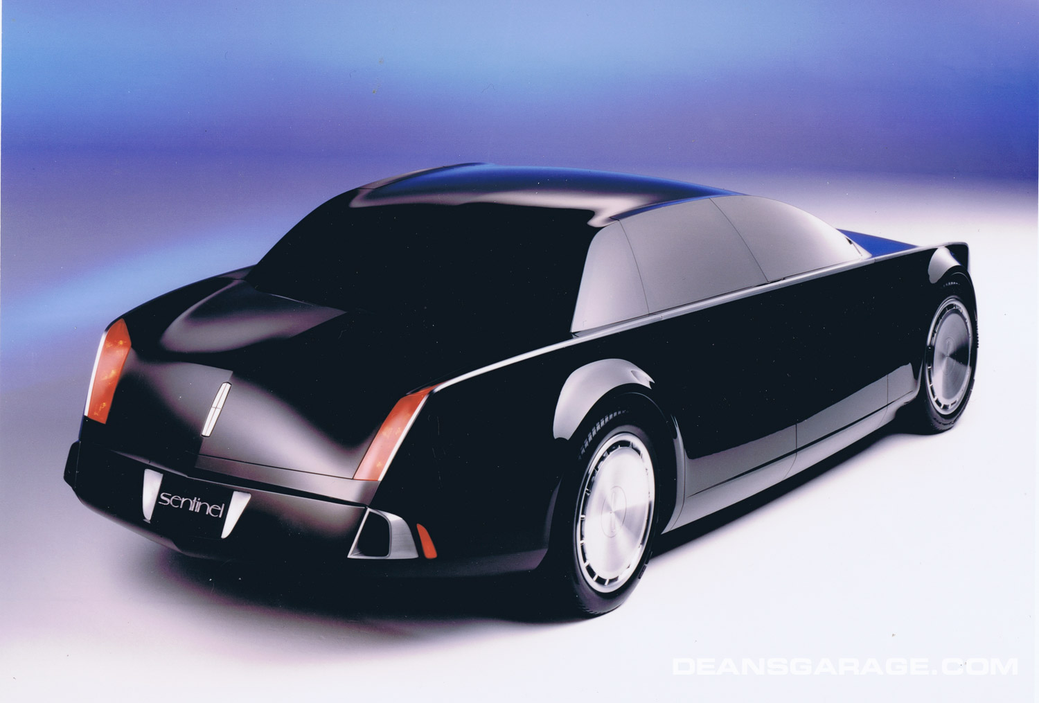
After 1998, no new model Town Car was introduced, and by 2011, with sales of 15,116, the Town Car was quietly discontinued. In the past, Lincoln had been marketing a new Town Car model every 8–10 years, so a replacement was expected by at least 2005–06. The Lincoln Sentinel, a concept car designed in 1993–96, was supposed to be a replacement for the Town Car, although it’s unsure the name or size would have remained the same. Although there has been speculation, since 2011 there has been no successor to the Lincoln Town Car, nor is one likely.
It’s hard to say exactly where the Sentinel’s design came from, but its designers suggest it was strongly influenced by Ghia. Directions to start designing a new Lincoln came from Jack Telnack, then Ford’s vice president of design. Telnack’s directions landed on the desk of Claude Lobo, a French designer in charge of Ford’s Dearborn Advanced design studio. During previous European assignments, Lobo had been responsible for development of Ford’s “New Edge” design theme, which showed up in this country on the Indigo and GT-90 concept cars.
Designers in Dearborn’s Advanced studio who actually designed the Sentinel were Rick Wells, Chief Designer, and designers Paul Hudacek, Camillo Pardo, Tyler Blake and Steve Eum. According to Wells, although all studio designers contributed to the Sentinel, the designer primarily responsible for the final looks of the Sentinel was Hudacek, although other designers credit Eum.
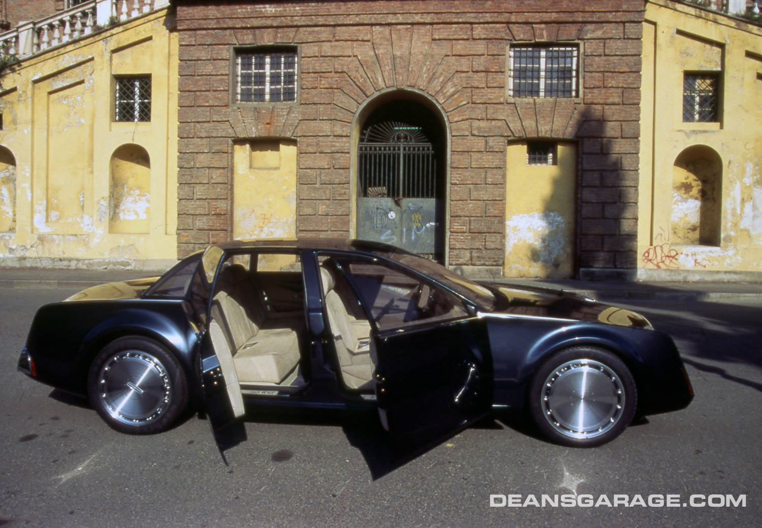
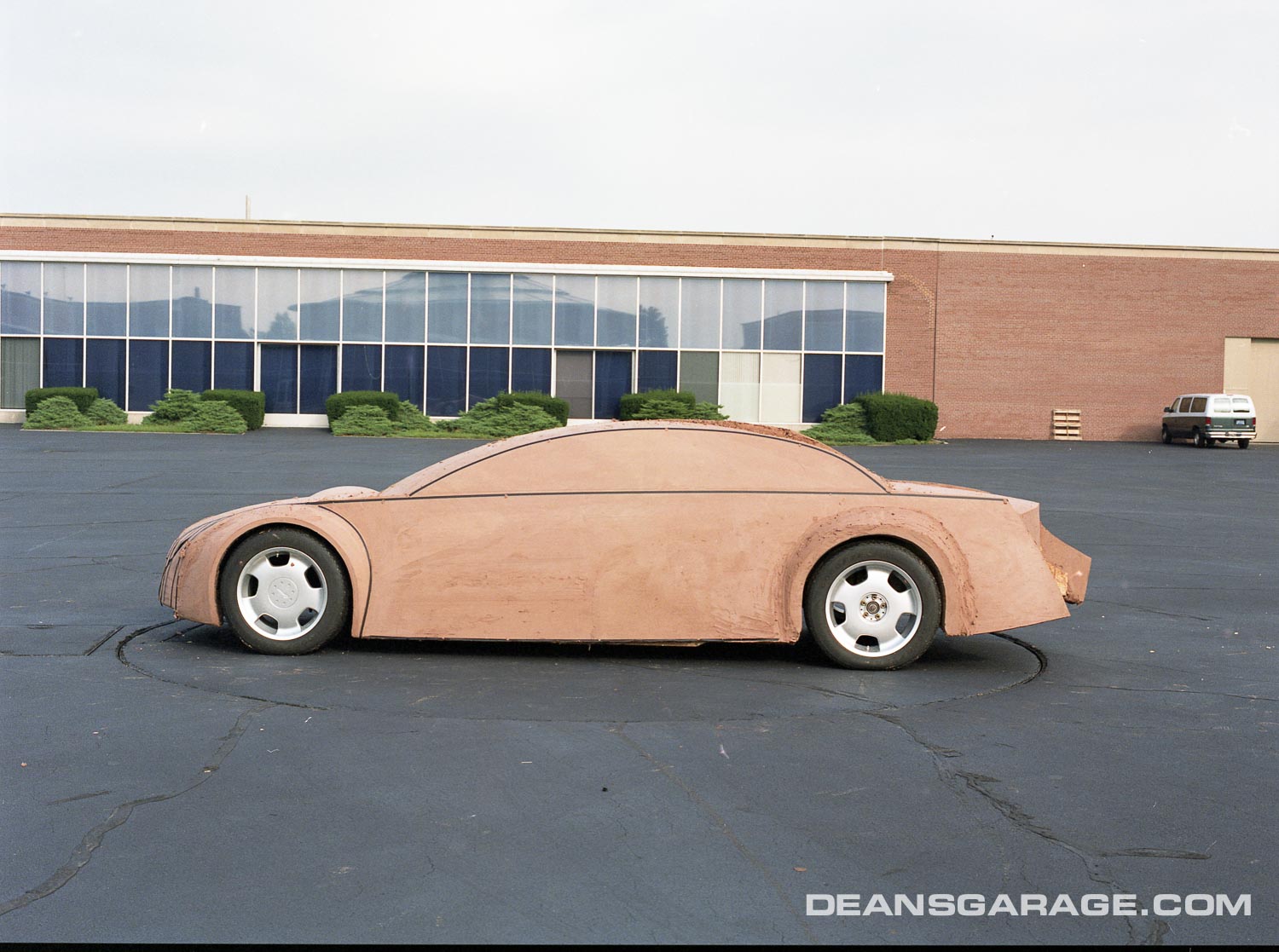
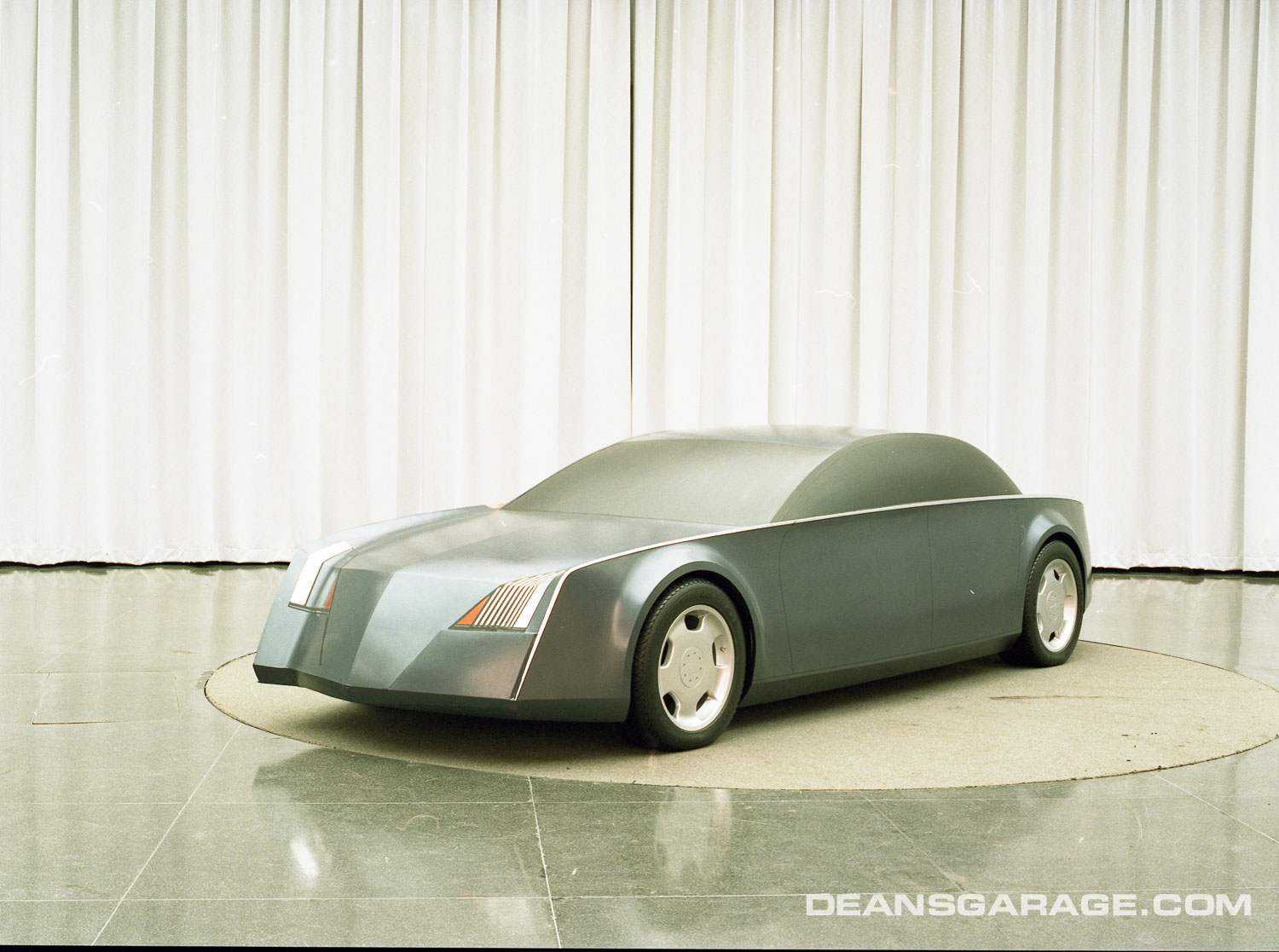
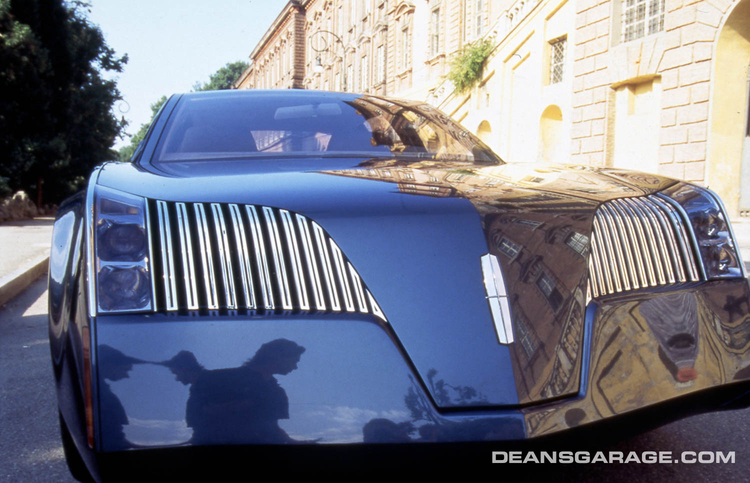
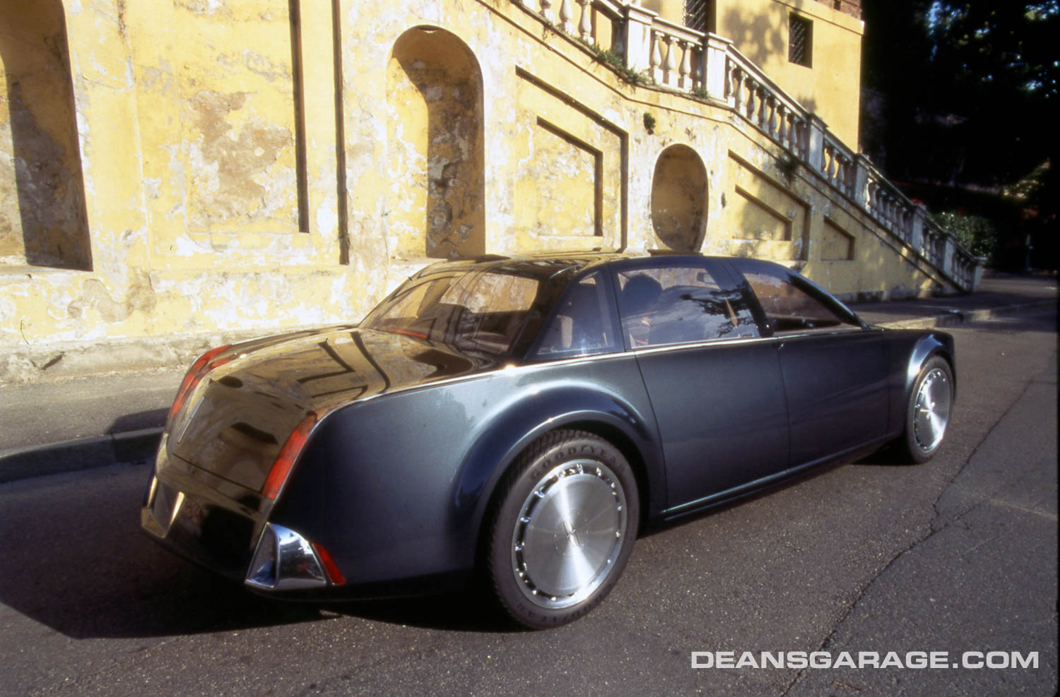
The Lincoln Sentinel was part retro. At Telnack’s suggestion, the Sentinel’s grille paid homage to the 1941 Lincoln. The Sentinel also took its high beltline from the 1961 Continental. All designers contacted expected changes to the final design of the Sentinel when it was productionized, especially as to size and the front end. Its designers are also quick to point out that the Sentinel is not entirely “New Edge.” They also acknowledge the Sentinel was a design that people at first view either loved or hated.
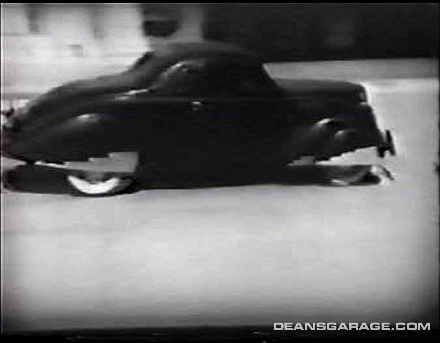
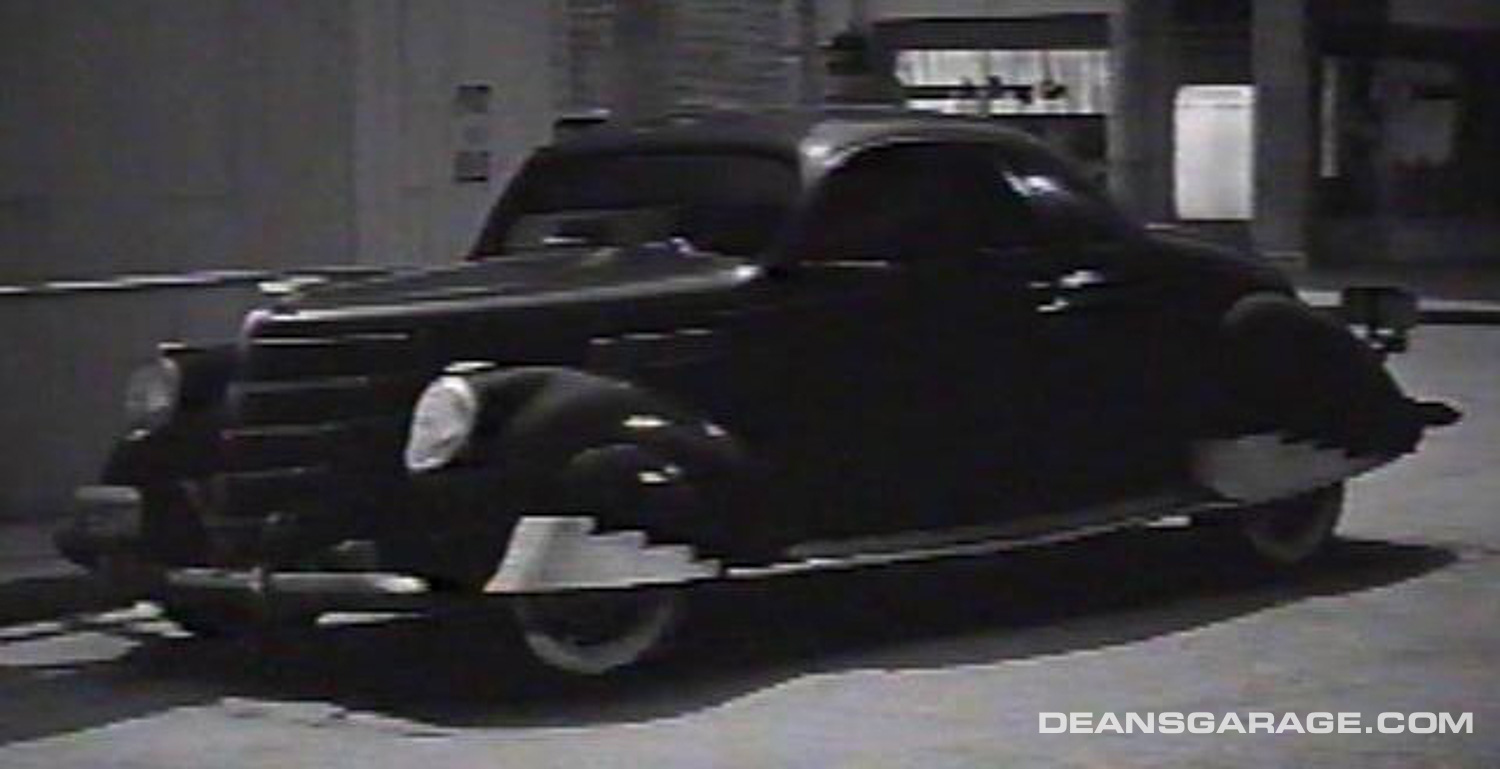
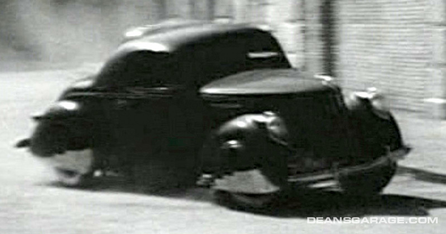
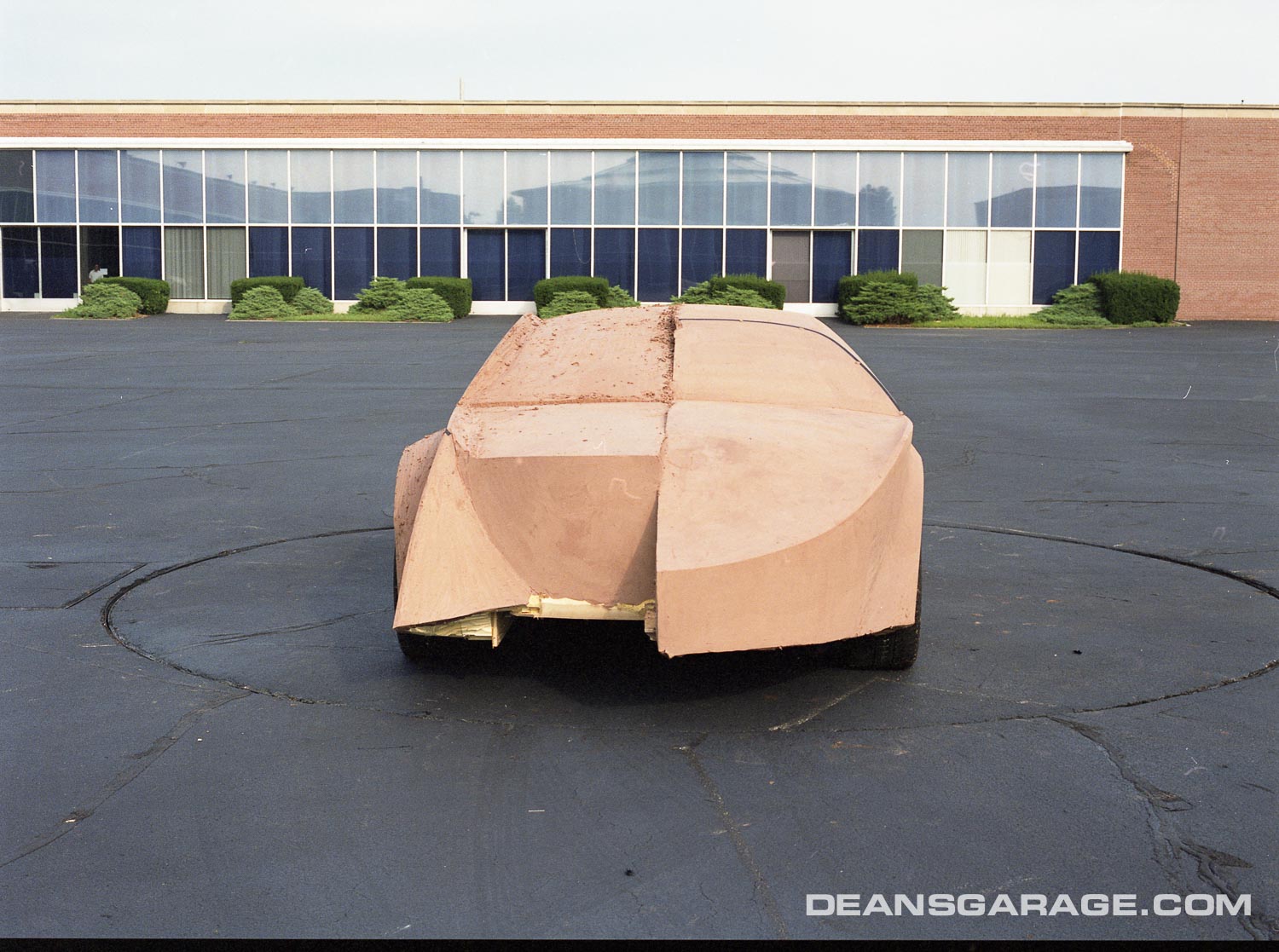
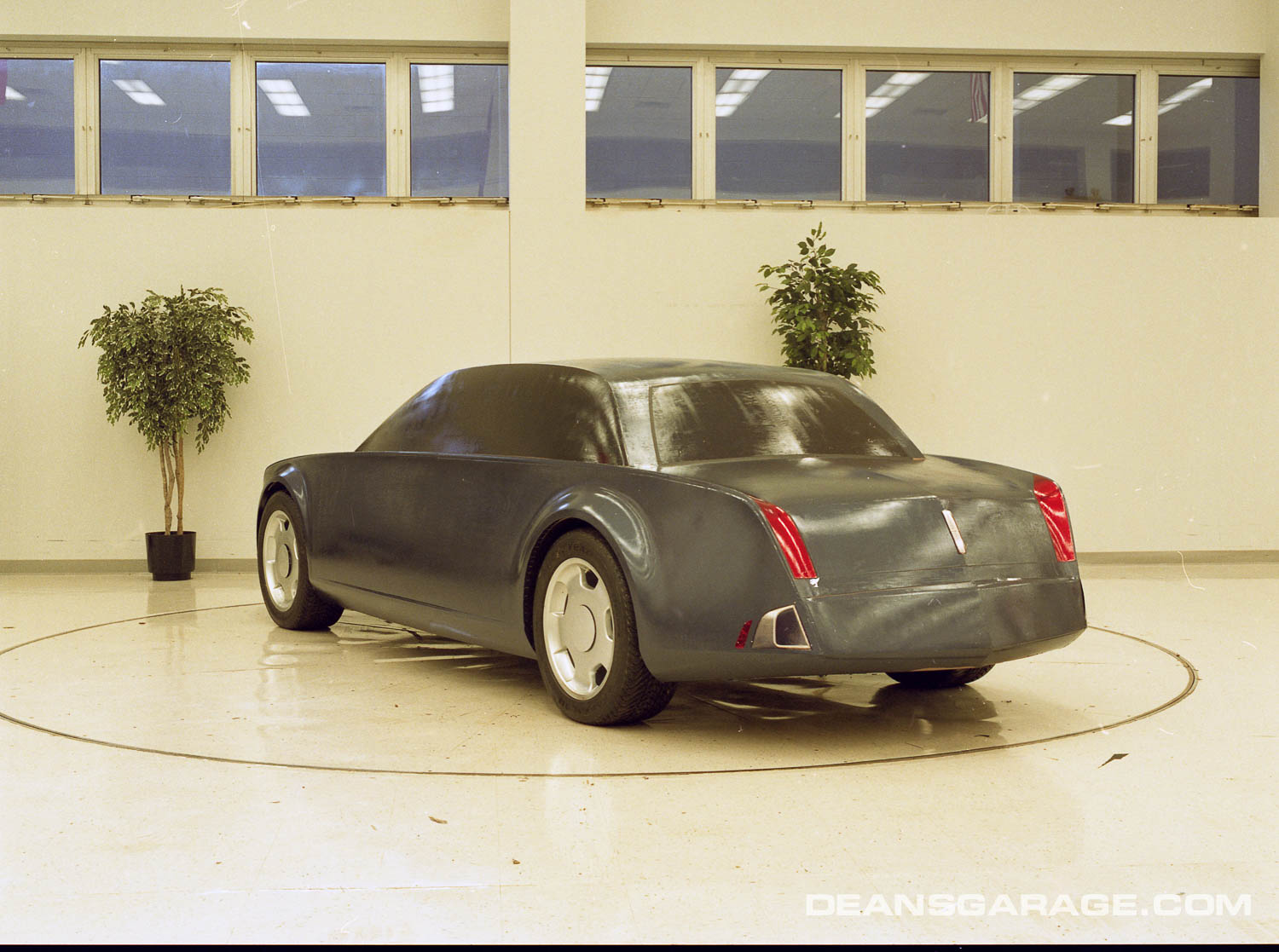
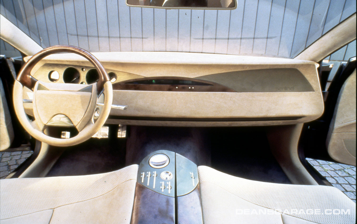
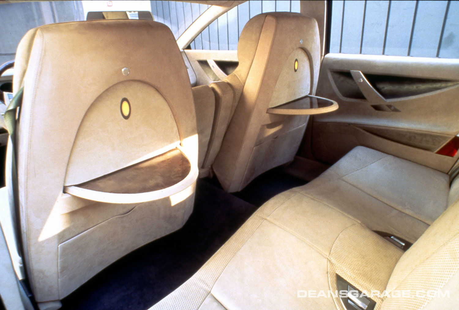
When the design was completed, the full-sized model of the Sentinel was cast in fiberglass as a show car, but with no engine, running gear or interior. Plans for the car were then sent to Ford’s Ghia design studio in Turin, Italy, to be constructed as a full-sized operable car, but at 7/8-size. When the plans were sent to Ghia, it was without an interior. The interior was designed and installed at Ghia, and is described as more true to the “New Edge” design theme than the exterior. When the build was completed, the rear-wheel-drive operable Sentinel had flush glass and a 6-cylinder engine. It was test-driven through the Italian countryside, during which time a video was taken of the car. When it was returned to Dearborn, the 6-cylinder engine was replaced with a 6-liter, direct-injected V-12 engine featuring dual overhead cams and putting out 435 horsepower. (Ford made their V-12 engines by electron welding together two production V-6 engines.) The operable Sentinel is 218-inches long (an inch shorter than the Town Car) and rides on 20-inch tires. It has rear suicide doors, and was built on a Jaguar chassis.
The inoperable Sentinel was first shown at the Detroit Auto Show. The 7/8-sized operable Sentinel was first shown in August at the ’96 Pebble Beach Concours, where Lincoln was the feature car that year.
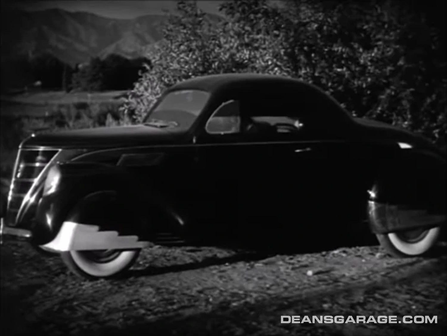
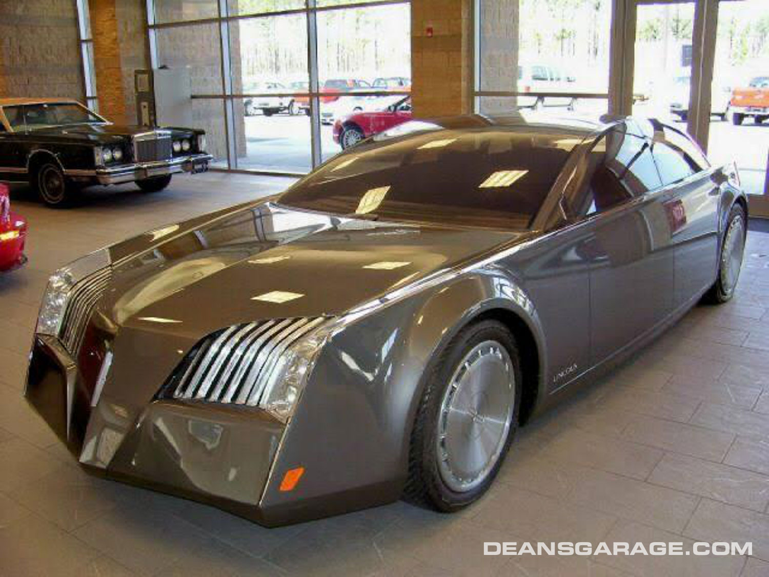
Unfortunately, the Sentinel was savaged by the American automotive press. They said it was “ugly,” it was “odd,” and it was “sinister.” In an almost comic-strip way, the Sentinel was compared to “Black Beauty,” the Green Hornet’s 1937 Lincoln Zephyr 3-window coupe, and/or to the F-117 stealth fighter plane. Jabs also included ones like “What were they thinking?” Needless to say, Ford management was not prepared for the outpouring of scorn the Sentinel received. At some point, in an effort to make the inoperable Sentinel look less sinister it was repainted a charcoal grey, but by that time it was probably too late. Over the next few years, the “New Edge” design theme was used at Ford on a few new models, like the Ford Mustang and Mercury Cougar, but it was never adopted as a long-term general design theme by any of Ford’s car lines.
The Sentinel may not have been well received by the U.S. automotive press, but in Europe it was a totally different story. Europeans loved it, and the design of the Sentinel received multiple awards. It was named Concept Car of the Year by England’s Motor Sports magazine. Ford quietly sent designer Rick Wells and the operable Sentinel (at the magazine’s request) to England to receive the award, which Wells still has. Wells was also featured on an English television show driving the Sentinel about London.
According to Lincoln designers, during the time the Sentinel was at the Pebble Beach Concours, Jac Nasser, then a Ford vice president, asked that the Lincoln design studio do a workup of the Sentinel in different packages to see if it could be adapted for a future Lincoln production model. That was either unsuccessful or the bad press or combination of the two stymied any consideration of the Sentinel as a future production Lincoln. To this day, Telnack (now retired) believes the Lincoln Sentinel should have been produced.
Fast forward to 1999. Cadillac introduced an edgy new concept car called the Evoq. Several years later, the edgy design of the Evoq was introduced on Cadillac’s new production CTS model. Cadillac’s edgy design theme is referred to by Cadillac as an “Art and Science” design theme. It has been followed on all Cadillac production vehicles since 2003—with great success. The Evoq was designed by John “Kip” Wasenko. He and all other Cadillac designers contacted uniformly report that the edgy design theme displayed on the Evoq and subsequent production Cadillacs was not in any way inspired by the Lincoln Sentinel. However, Cadillac’s success does make one wonder what would have happened if the Sentinel’s design theme had become the basis for a future production Lincoln.
According to retired Lincoln designers, the grille of the Sentinel found its way onto the 2011–15 Lincoln MKX, but other than that, little to nothing from the Sentinel made it onto any future production Lincoln. The operable full-sized Sentinel is presently in storage at a facility in Plymouth, Michigan. The inoperable model was sold or given to O.C. Welch, a Lincoln dealer in South Carolina. It was displayed on his showroom floor for many years, and then put up for sale.
Photos: Ford Design
Books by Jim and Cheryl Farrell
Ford Design Department—
Concepts & Showcars
1999, 10×13, 400 pages, Fully indexed
900 photos. Includes 150+ designers and sculptors, and highlights 100 concept cars.
ISBN 0-9672428-0-0
Lincoln Design Heritage:
Zephyr to LS (1936-2000)
2021, 10×13, 480 Pages, Fully Indexed
1,600 photos and illustrations
ISBN 978-0-9672428-1-1
The Ford book is $50 plus $7 S&H (US). The Lincoln book is $85 plus $10 S&H (US). Both books bought together are $110 plus $17 S&H (US). To order, email: cfarrell57@gmail.com

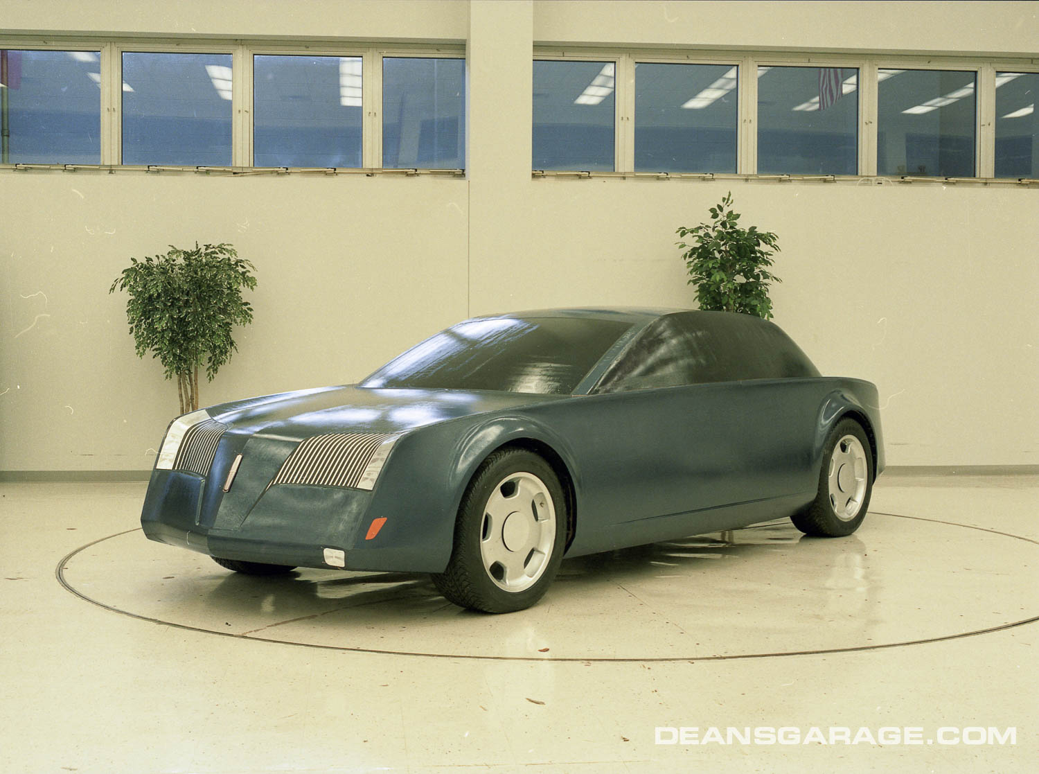
If the Sentinal were an electric vehicle concept, the front end likely would have been praised by the critics. In recent Lincoln history, the last grill treatment of the departed Continental was the most pleasing to my eyes, but that is solely my opinion. Every new and refreshed Cadillac that I see seems more and more resembling a Chevrolet from the front, even if not every Cadillac shares the same platforms. The rear of the Cadillac look like Caddys, but only in taillight details. The Sentinal’s future was likely lost when Ford’s Premium Auto Group was disbanded. I know a number of people, all over the age of 60, who would like an updated version of the Town Car that was NOT the MK-S. In Indiana, there are an amazing number of Panther platform Ford Crown Vics, Mercury Marquis and Lincolns Town Cars ,still on the road!
The basic design concept has great potential but in that form it is in my opinion unfinished resulting in some awkwardness. The proportions of the three box profile is very unusual and I think the main objection to the car is the front end.
I disagree that if it was electric it would be well liked.
What I see in the pictures is a crude representation of a very idealistic concept. That was probably the charm when it was first conceived. A series of exploratory scale models by the different designers involved could have been done to explore the concept and been very productive toward refining it.
As often happens it appears that those involved were enthralled by the basic idea when first seen three dimensionally. Consequently they stopped evolving the design. They confused ‘different” with being “good”.
As a piece of sculpture, which every car is, it is not properly executed. It would really be fun to do that concept with a talented sculptor as I think it could truly be a very interesting design.
Funny thing about design. Sometimes different IS good, because the public is often bored by mild evolved designs. When Chrysler cliniced the “Louiseville Slugger” Dodge pickup replacement, people thought it looked like a GM pickup left out in the rain like a used bar of soap. That result inspired the Dodge Ram with a distinctive raised hood to front fender design. When at clinic, people either loved or hated it. That meant it moved the needle which is better than being an clone of somebody else. The resulting sales proved that a lot of people liked different, and took a big bite out of GM & Ford pickup sales. So much so, that both aped the general theme to this day!
OK, I’ll step off in a different direction: I think this car would’ve changed the mental picture of “Town Car” from a stodgy, lardy set of boxes-on-wheels (which was its profile) to a newer, more modern big car for around town. “Town Car” today is a cliche’, and not a positive one: it exudes “senior citizen”, and again, not in a good way. The Sentinel’s era was marked by the crushing downfall of the previous American luxury car from its previously exalted heights – to the point where a car that Europeans saw as a taxicab (it’s a Mercedes) became the luxury standard and people who bought Caddys and Lincolns got asked “Why did you buy that?”.
Recalling when David E. Davis Jr., quoted Bill Mitchell’s having said while participating in a product clinic in St. Louis, when members of the target market group didn’t like the styling of some new prototype, Bill stood up in the dark room and yelled, “What the h__l does anybody in St. Louis, Missouri, know about designing cars anyway?” Perhaps this applies to comments made about the Lincoln Sentinel concept, that sabotaged any further thought of continued design development towards a production vehicle? Jack Telnacks view to proceed towards production was correct but sadly unheard!
We had it at Amelia on a front T box flanked by Jim Schmidts 40 Continental coupe and a 1961 Sedan. What I wanted to do was illustrate the origin of the design. When putting it in that vein, it represented where Lincoln had been and where it wanted to go. I like the basic look, just some details didn’t work quite right. All in all, it wasn’t that bad.
Considering the Cadillac and Chrysler competition at the time, I applaud the boldness of the Lincoln Sentinel. I only wish that they would have spent time completing the concept. As it is, the proportion is off, the scale is too small. and the design language communicates folded fomecor. Front end show promise. Rear looks like it is off another car…doesn’t go with the design theme. Do love the Bugatti wheels.
Just my $0.02 opinion.
In the truest of Lincoln tradition, this wavering division still makes only two styles of cars, cutting-edge outstanding and dreadfully ugly. While I like the very original and innovative name Sentinal, those horrible wheels and front fenders are what killed it as a Lincoln. They would have worked better on a Mercedes, Cadillac or Citroen, where pleasing styling is a form of vulgarity.
While I applaud Lincoln’s retro creative use of the 1937 and 1964 grille designs, I’m still nervous why Ford marketing keeps distancing Lincoln Division from itself, a subtle ebb that has been taking place since disconnecting life support on Mercury.