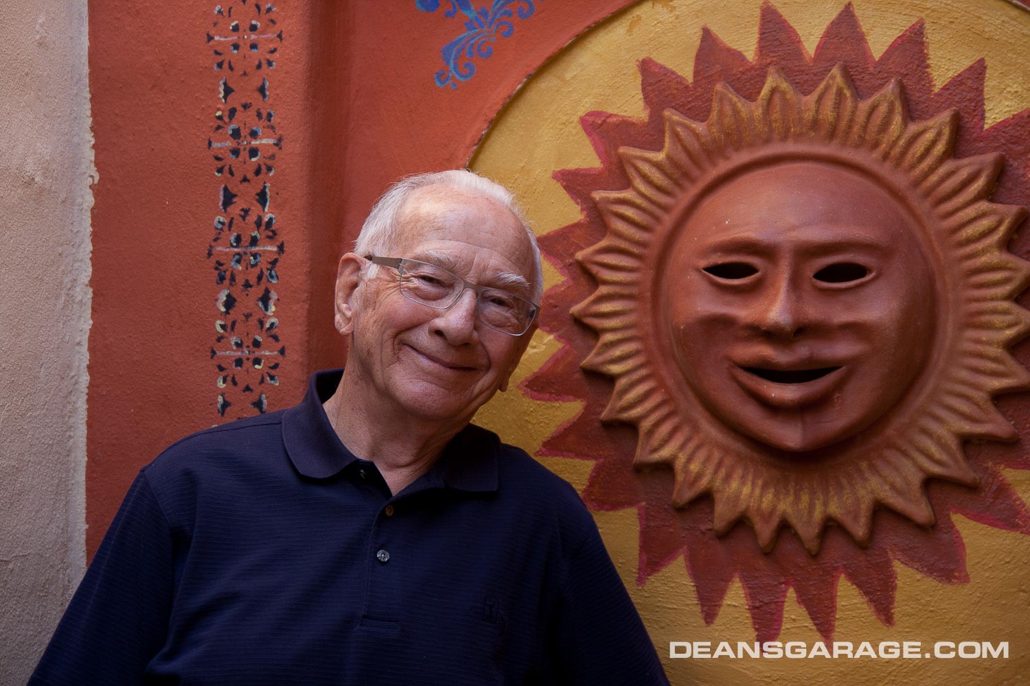
Bernie Smith
From Clark Lincoln: I am sad to report the passing of my good friend and previous boss at Design, Bernie Smith. Bernie was fighting a heart condition that finally took him peacefully earlier this month (April) in his Dexter home. He was predeceased by his (4th) wife of some 20 years, Susan. He is survived by his son and daughter and four (?) grandchildren.
I considered Bernie a good friend, and I will miss phoning him on his birthday, two days and 20 years before mine. When I started GM Design Staff, he was Chuck Jordan’s assistant. I remember him coming back into the studio alone after a review with Chuck to interpret and bring clarity to Chuck’s direction. Unlike many executives at Design Staff, Bernie was soft spoken, approachable, and considerate. I don’t remember when this started, but he called me son, and I called him dad when I’d talk to him on the phone—we both have the same last name.
Bernie rode motorcycles, dirt and street bikes. Once Kim Boose and myself went to Bernie’s home in Rochester, and each took a turn on Bernie’s big Kawaski KZ 1000, a very fast bike at the time. I took it out for a few miles, then Kim got a turn, but got pulled over. It was way too tempting to lay into the throttle.
Bernie (with his son, and Karl Kendell) was with me when I got hurt on my 250 Bultaco in 1978 near Port Huron. See The Surveyor—MItchell’s Ultimate Bike Racer Van.
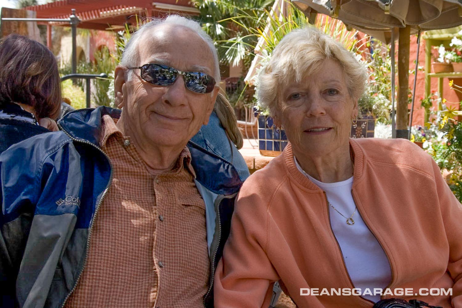
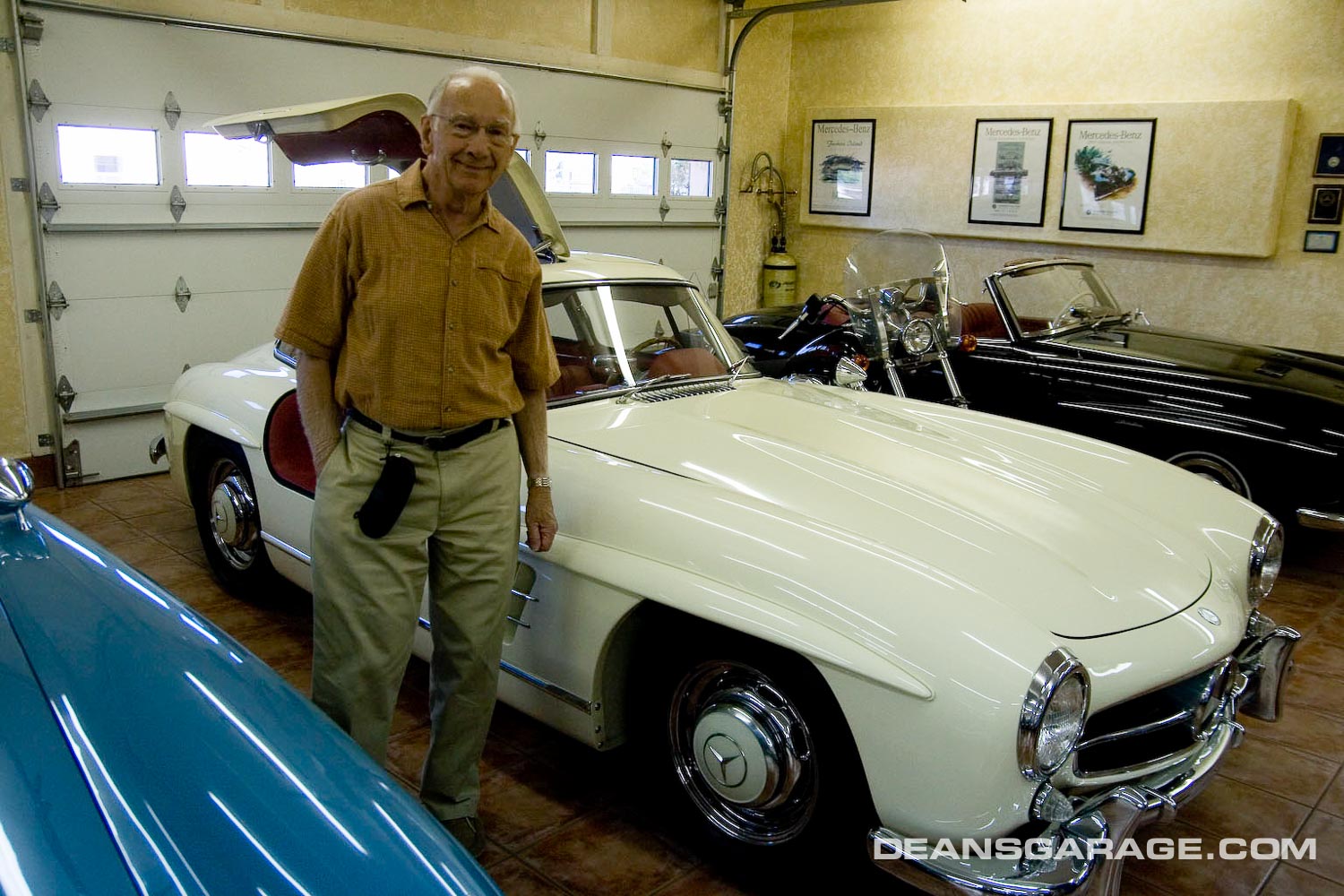
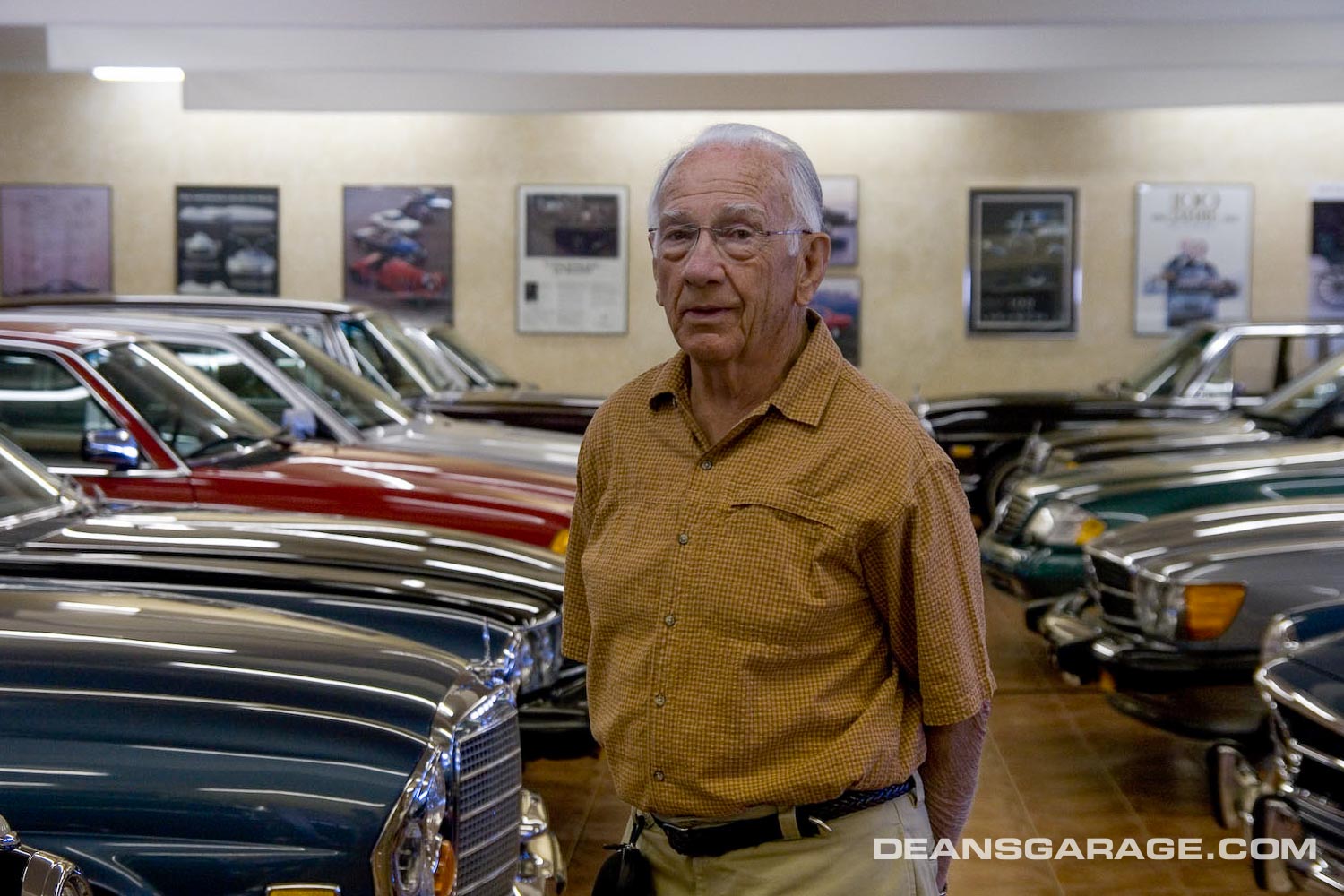
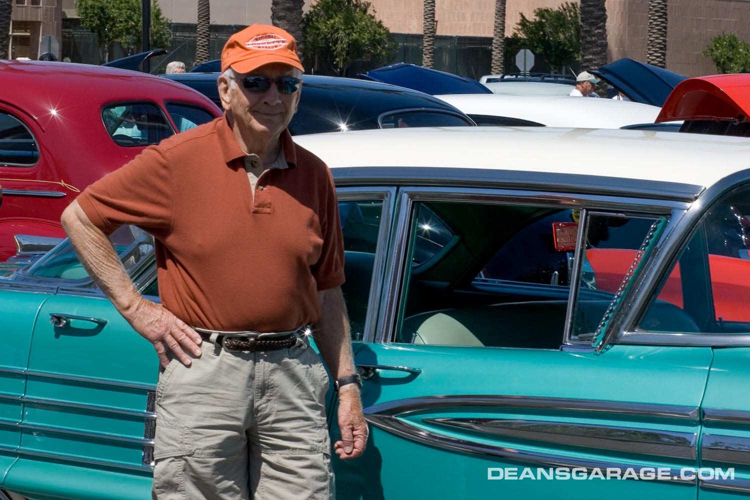
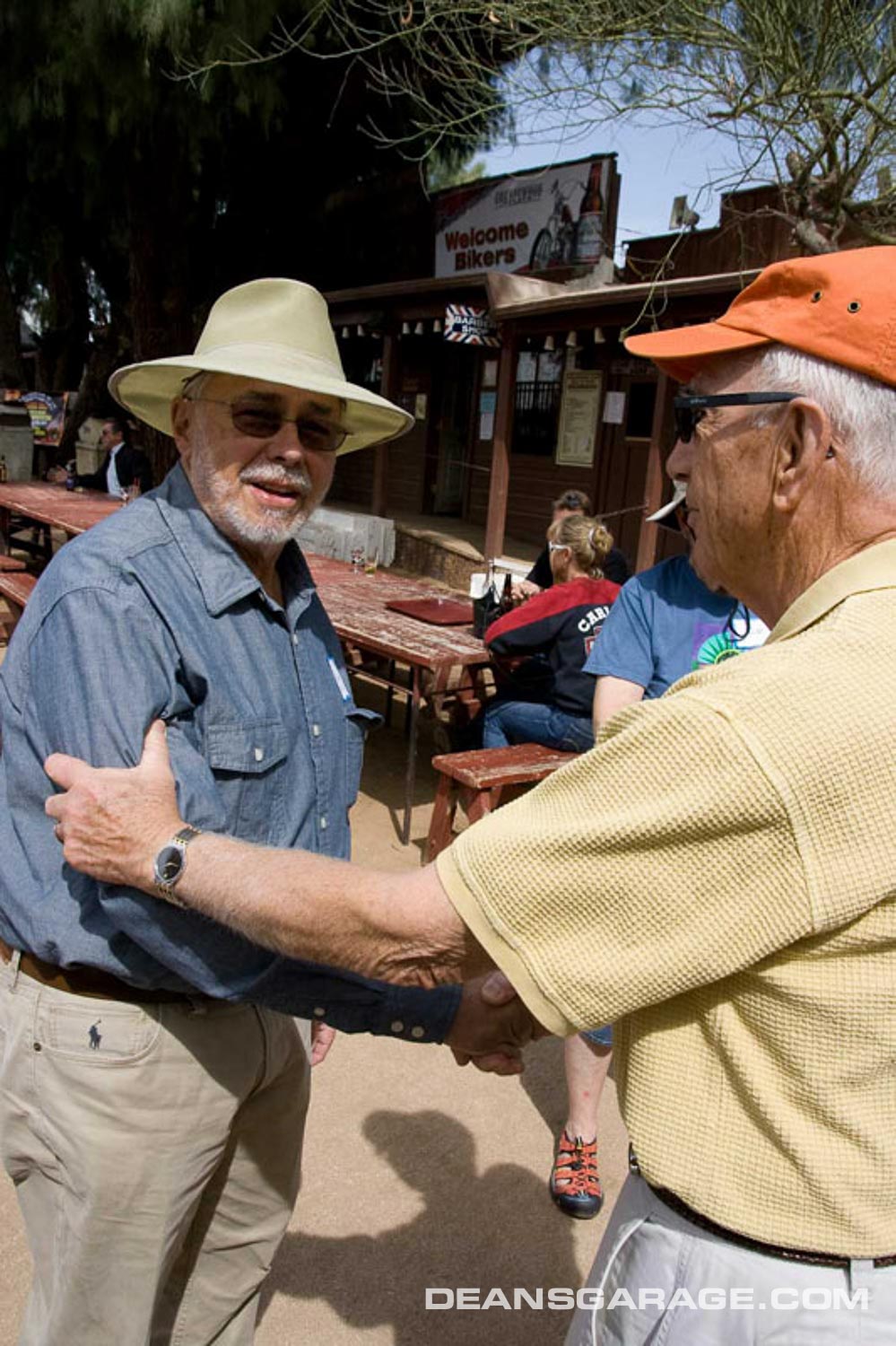
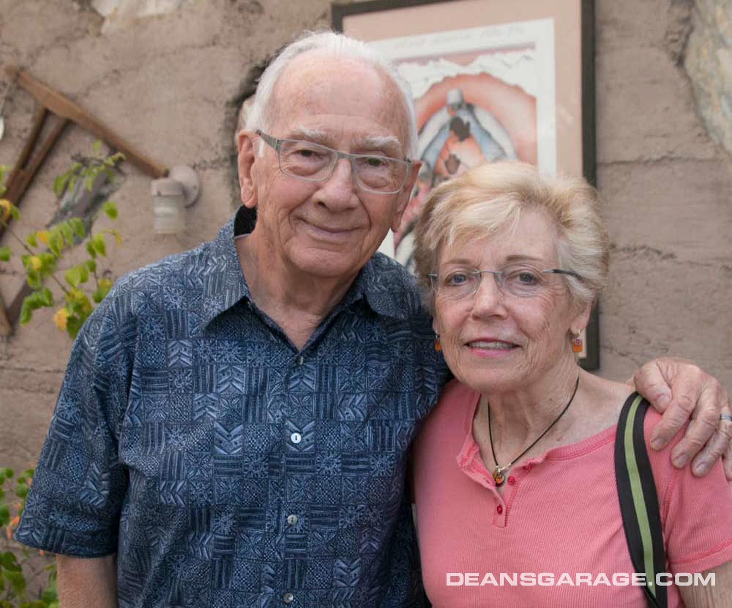
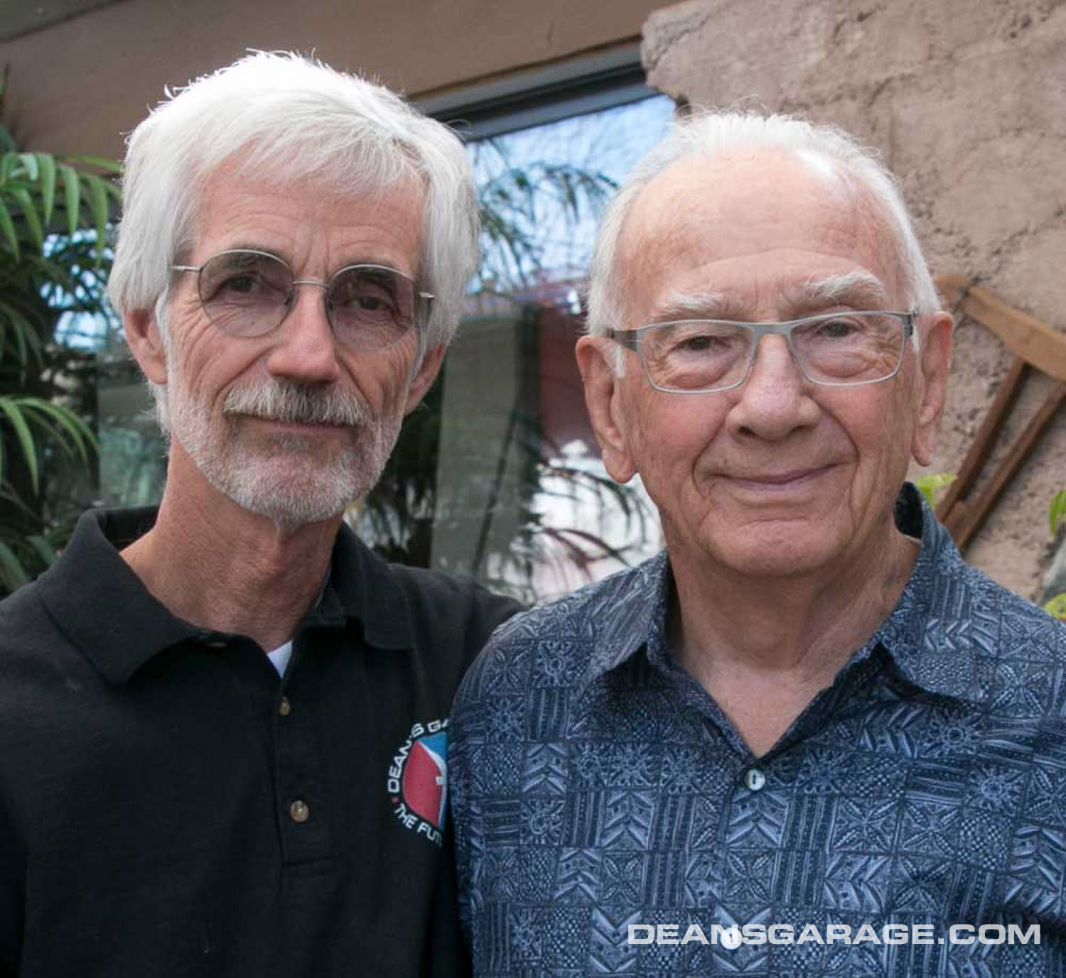
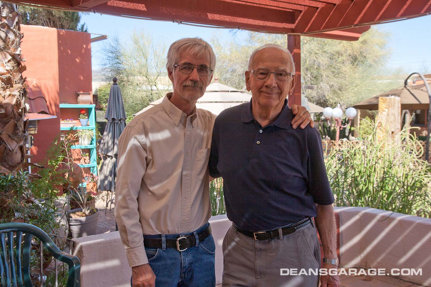
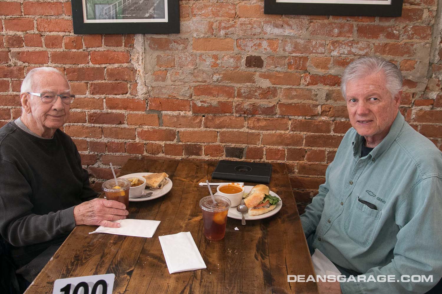
For several years Bernie and Sue would drive out to Arizona for a few weeks, and that would spark the local designers to get together. I’ve included a few photos from some of those trips, including a visit to Neil DeAtley’s car collection in Scottsdale, Arizona.
In the spring of 2019 Bernie sent me copies of some of his memoirs he’d been writing out by hand. They ended up in the Dean’s Garage book, and I’ve included all of them in this post. The story of his 1958 Olds design and encounter with Harley Earl was previously published on Dean’s Garage.
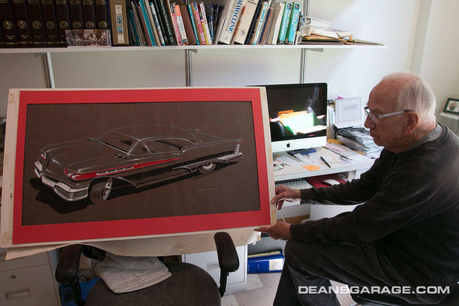
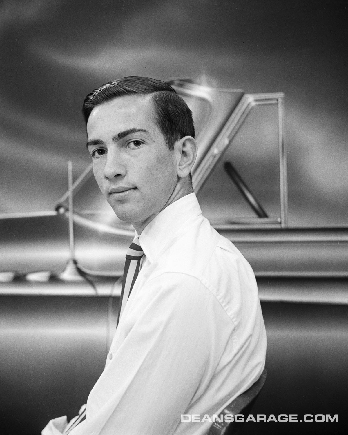
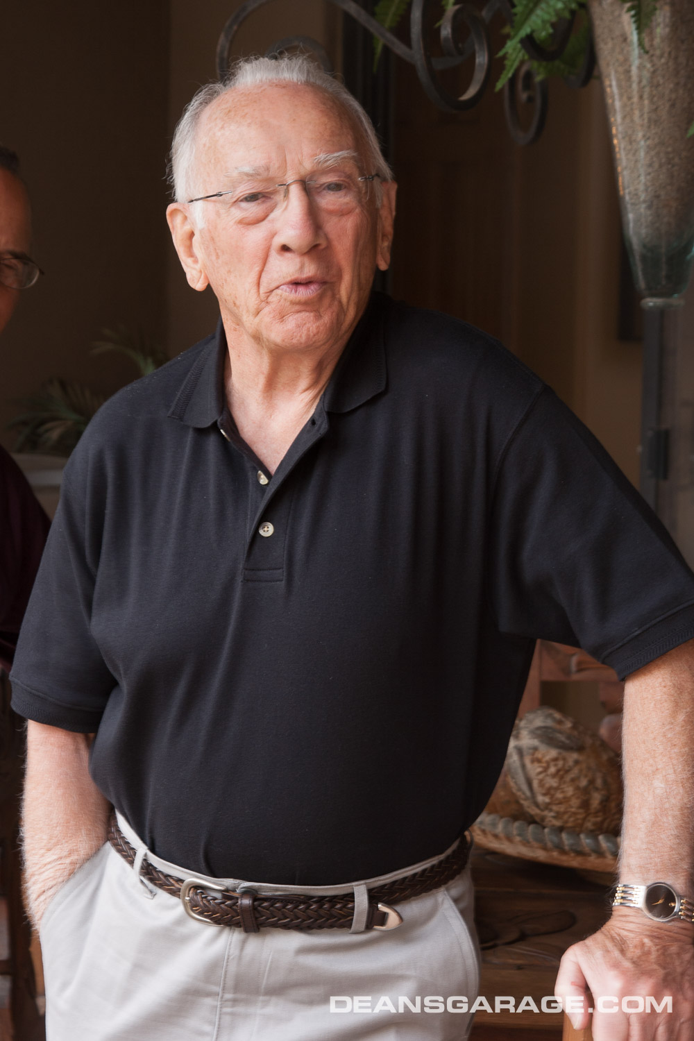
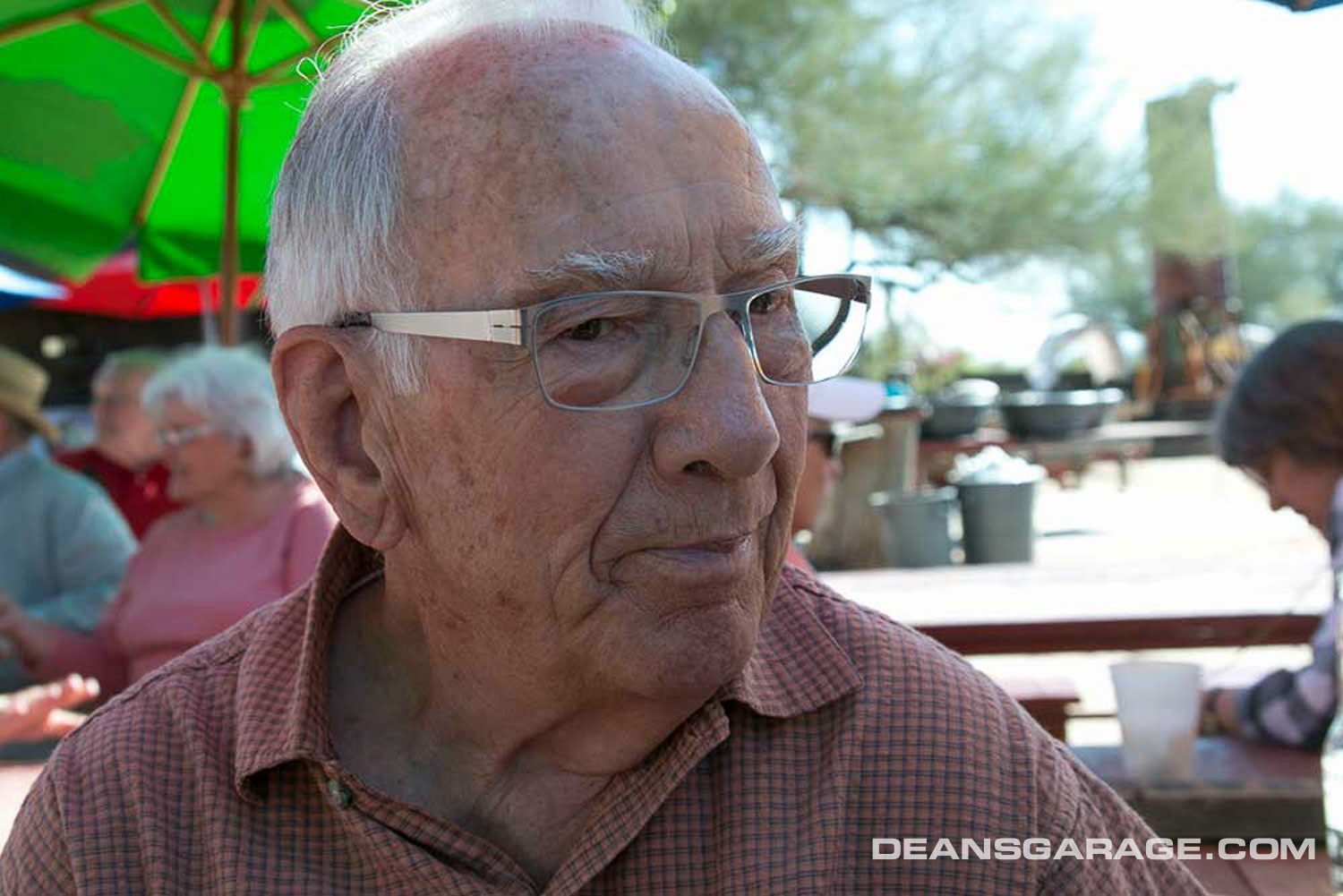
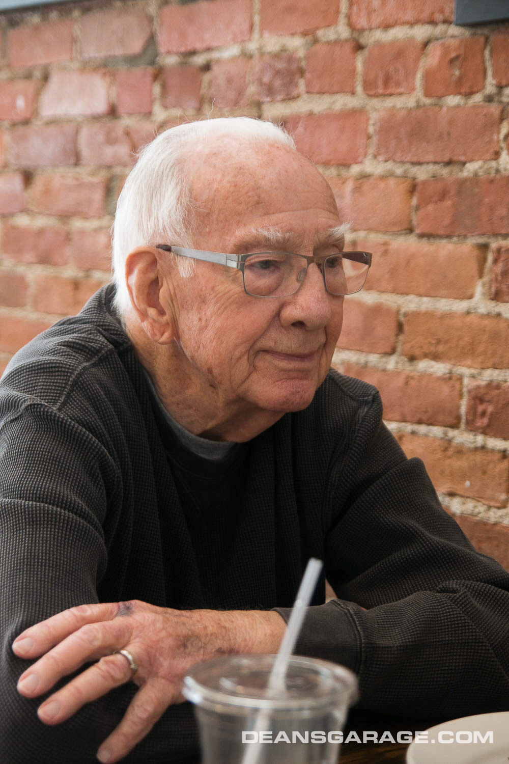
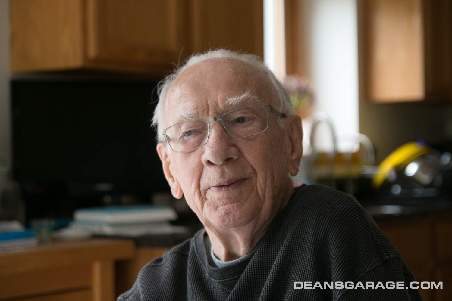
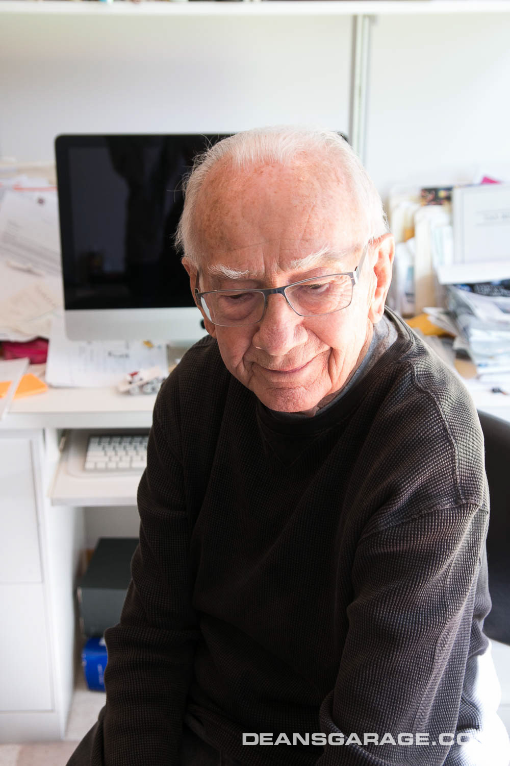
In May of 2019 on the trip to GM Design Center researching photos for the Dean’s Garage book, I met with Clark Lincoln and Bernie Smith in Dexter, Michigan. I spent some time with Bernie at his home, and was able to photograph him with his ’58 Buick rendering.
I’ll miss Bernie.—Gary
From Dean’s Garage—The Future Is Back
Harley Earl
I was with General Motors Design Staff for 38 years, from 1950 to 1988. I had the privilege of working as a designer under the direction of Harley Earl for nearly ten of those years.
Mr. Earl was a very imposing figure who towered over nearly everyone. His mere presence commanded respect. However, his high-pitched, almost squeaky voice did not match his physical appearance. But when he spoke everyone listened. No one ever called him Harley, with the possible exception of his wife and some of the top brass at GM.
He was respected (or feared) by nearly everyone who encountered him, including the highest echelons of corporate management. They all knew that he had a direct line to the highest office in the corporation and wouldn’t hesitate to use the phone if anyone disagreed with him.
He wittingly (or unwittingly) surrounded himself with people who agreed with his point of view. That’s not to say that his designers didn’t come up with fresh, new ideas. But when it came decision time, few ever disagreed with him. And as we all know, throughout most of his career he was usually right.
I believe he did lose some of his “magic touch” towards the end because of his unshakable belief that cars should perpetually get longer, wider, and lower, and laden with more and more brightwork, or “chromium,” as he called it.
Earl felt that automobile styling should provide entertainment. After all, he was from Hollywood. He believed that no matter what angle a car was viewed, there should be something of interest to look at.
Here are several stories that make me smile as I remember Mr. Earl.
When I Hired In
I graduated from a small art school in Cincinnati, Ohio, and didn’t have the slightest clue who Harley Earl was. But I soon found out. I was placed in Pontiac Studio where we saw quite a bit of Mr. Earl.
Paul Gillian, a senior designer, took me under his wing. The first advice he gave was to make myself invisible when Harley Earl came into the studio, at least until I learned the ropes. Earl had been known to fire someone on the spot for not having the correct answer to one of his questions.
Paul also advised that I should never stay in the studio during lunch hour. Earl liked to browse through the studios by himself to mull over designs, and firm up his thoughts. If you were in the studio by yourself, he was bound to ask you some difficult questions which could quickly become your undoing. Needless to say, with those words of wisdom from Paul Gillian,
I survived those early years working under Harley Earl’s leadership.
I don’t think Mr. Earl knew many of the designers’ names, other than the studio chiefs and their assistants, so I was flattered that he ultimately got to know mine. The only problem was that he always called me Ernie, rather than Bernie. I wasn’t going to correct him.
Art Ross
In the mid-1950s I was a designer in Oldsmobile Studio. Harley Earl was coming into the studio every day or two and was riding Chief Designer Art Ross extremely hard because Art was not getting the plan view lines on the hood of the clay model to his liking.
As Earl became more upset, to use a mild term, Art became more frustrated. Finally after about a week, a light bulb went on in Art’s mind. He figured out why he had been unable to get the hood lines right.
Art Ross was a short guy, at least a foot shorter than Earl. Art correctly deduced that Earl was seeing the top of the hood from an entirely different perspective than he was.
His solution was to have a studio tech draw up a pair of 12-inch platforms to strap onto the bottom of his shoes. He had them made in the Wood Shop.
When they were delivered, he tried them on and walked over to the clay model. He immediately saw the problem on the hood as Earl had viewed it.
At that very moment, Harley Earl walked into the studio. I remember that I was at my desk.
I winced, and kind of bowed my head. I wasn’t sure I wanted to be a witness to what might unfold.
Earl stared at Art a moment and asked, “What on earth are you doing, Arthur?” Art, caught red-handed, told him the truth. “I wanted to look at the clay model from your perspective Mr. Earl, and now I can see what’s wrong with the lines on the hood.”
Earl stared a few more seconds and said, “Now Arthur, that’s using your noodle!” We all sighed a big sigh of relief, but no one was more relieved than Art Ross.
1958 Oldsmobile Design
In 1956 I was a designer working on the 1958 Oldsmobile. Earl had become convinced that the American public wanted larger and larger cars with increasingly more “chromium.” Most of the designers resisted this movement towards more brightwork, but they knew that Earl would ultimately have his way.
We were struggling to come up with a design theme for the ’58 Olds, and Earl was giving Olds Design Chief Art Ross a hard time.
I knew that Earl liked almost anything with a “bullet” shape, so I created a large rendering of a design with a reverse bullet shape that came off the headlamps and flowed back onto the front door. I added just enough chrome to attract his attention, and rendered the car in black with the bullet shape accented in red, one of his favorite color combinations. You could say that I sold part of my soul to the devil, but we desperately needed a theme before he fired the entire bunch of us.
When I finished the rendering, I set it up by the studio entranceway—a choice spot that I knew would catch Earl’s attention as he walked by. I had no sooner gotten back to my desk when Earl popped through the door.
Sure enough, he stopped and looked at the rendering for what seemed like a long time. Then he poked his head into the studio and asked where Arthur was. Art had been in his office near the entrance with the door closed, and he must have seen Mr. Earl through the window in his office. He came bursting out to greet Earl.
Earl quickly led Art over to my rendering and said, “Arthur, you’ve got the design right here under your nose and you don’t realize it.”
I was at my desk across the room, so I missed most of the rest of the conversation. Earl did most of the talking. I could tell that Art Ross was not a happy man.
I had not considered the possibility that Mr. Earl would see my rendering before Art did. I had not been in Art’s good graces anyway, and was sure this would seal my fate. On one hand, he should have been pleased to finally have a design that Earl liked. But on the other hand, I’m sure he didn’t like the idea of executing a design on which he had not passed judgment. The design was modeled full-size and became the central theme for the ’58 Olds. Art gave me little say in the execution of the design, and Mr. Earl kept adding more brightwork.
Thankfully for me, after a few weeks had passed, Earl transferred the Oldsmobile designers into Pontiac Studio, and the Pontiac designers into Oldsmobile Studio, except the chief designers and assistant chief designers.
I never knew exactly why he made this move, but he did move designers around a lot because he felt it kept them fresh and energized.
Don Lasky, one of the Pontiac designers who transferred to Oldsmobile Studio, told me the rest of the story regarding the design of the ’58 Olds.
Don said that Earl felt my “bullet” theme coming off the headlamps left the rear quarter looking rather vacant. He told the designers to come up with some additional “entertainment” in that area. Lasky came up with a design that looked like a musical staff.
It has been said that the ’58 Olds looks like one designer did the front portion of the car and another designer did the rear. Well, that was pretty much the case. I’ve not confessed to many people that I had anything to do with the ’58 Olds because I don’t think it represented the best efforts of Harley Earl, General Motors, or myself.
Although Harley Earl showed signs of “losing it” near the end of his career, the many years of successful, outstanding designs giving the American public exactly what they clamored for, far overshadowed the occasional misstep. Even the ’58 Olds did reasonably well in the marketplace.
1958 Buick Bodyside
Mr. Earl had very strict orders about personnel from one studio not visiting another studio. He felt very strongly that designs for one division of the corporation should in no way be influenced by the designs of another division. Restricting designers from moving freely about helped insure maximum differences in the appearance of the vehicles from one division to the other.
However, this didn’t keep designers from talking with one another. I heard this story secondhand from the designers in Buick Studio who worked on the ’58 Buick. I was in Olds Studio at the time, but we designers frequently talked to each other about what was going on in the various studios.
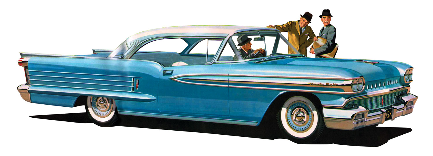
All divisional studios were working on the 1958 program, and like Olds Studio, the Buick designers were having trouble coming up with a side treatment that pleased Mr. Earl. The body surfaces were pretty well set,
but each division relied heavily on a strong side theme to give the car its divisional identity. Buick Studio, like ourselves in Olds Studio, was not showing Earl enough chrome, enough divisional identity, and enough “entertainment.”
The Buick designers had been trying various side treatments by tacking overlays onto a full-size side view rendering of the basic sheet metal.
They broke for lunch, and shortly after they returned, Mr. Earl came into the studio. He was known to browse through the studios at lunch time or late at night, when no one was there, to soak up the designs and formulate his opinions. That is exactly what he did while they were at lunch.
They saw immediately that he was in an upbeat mood. As the designers gathered around he said, “Now you fellows finally got it!” He pointed over to the full-size rendering which had two distinctly different side treatments, which they had neglected to remove when they went to lunch. There was no explaining to do. Earl had made his decision.
When you look at the ‘58 Buick, I think it is pretty easy to see the two totally different treatments on the side.

Over Thirty—Under Thirty
Every designer in the building was called out to the Styling patio to view several newly finished car models. After about half an hour, Mr. Earl arrived on the scene, and of course, they all gathered around him to hear what words of wisdom he might proffer. Instead of an anticipated pep talk, he asked the group of 40 to 50 designers how many of them were over 30 years of age.
Everyone was wondering where he was going with this, but all of the “over 30s” diligently raised their hands. He then asked that group to step over to his right, and all the under 30 group to step over to his left.
He then proceeded to let us know that the under 30 group were the creators and the over 30 group were the finishers—the people that knew how to put a design together. He said that both the creative designers and the older experienced designers were needed (sigh of relief), but that most of the fresh, new ideas came from the young people.
I remember the year—it was 1958. I was 29 years old, and while I was happy to be standing to the left of Mr. Earl, I had mixed feelings hearing from him that I could expect only one more year of creativity.
Clark Whitcomb
I was a designer in Truck Studio when it was located at Plant-8 and Chuck Jordan was the assistant chief designer. Chuck did not, however, have anything to do with the Clark Whitcomb antics, although I’m sure he knew what was going on. The ones who were involved were myself and fellow designer Don Lasky.
Clark was a very lovable curmudgeon, but very gullible, which made him a prime target for our antics.
We played a trick on Clark. He purchased a new felt hat which he was very proud of and wore to work every day. Don and I got the idea of putting thin strips of paper inside
the lining of Clark’s hat, adding a strip or two daily, unbeknown to Clark. This, of course, had the effect of causing his hat to fit tighter and tighter as the days went along. At the same time, we started making comments to him about his head looking larger.
We brought the whole studio in on what we were up to, so he was hearing this from different people. Finally, one evening as we were all leaving, we watched Clark struggle to tug his hat down over his head.
He finally got it to hold for a few seconds, then it popped upward about two feet and onto the floor. Paper strips landed all over the place. Clark got a big laugh along with the rest of the studio, mainly because he was greatly relieved he had not contracted some rare disease causing his head to swell.
Bill Mitchell, Less Than Dapper
One sunny summer day we took a clay model up to the Viewing Road (a secluded area hidden to passersby) at the north end of the Tech Center. It was one place on the Tech Center site that allowed us to view a design in natural surroundings—a winding road though trees and undulating terrain.
After the clay model was set up and we had our studio review, I called Bill’s office to invite him out. His
secretary told me that he was down in Mechanical Assembly, the garage where he kept most of his motorcycles and performance cars. She said that she would give him the message and she was sure he would be out to the Viewing Road as soon as possible.
A half hour went by, and no Bill. I called again and his secretary said that he had gotten the message, and was supposed to be on his way out. Nothing to do but wait.
After about another 15 minutes, we heard the roar of his bike. As soon as I saw him, I knew it was not good. He was even more red than his usual ruddy complexion. There was a large dent in the fuel tank, a rip in his matching leathers, and what looked like a scratch on his face. That was the first time I had ever seen him looking less than dapper.
He was visibly upset and not in a mood to talk about what happened.
We found out later that as he was leaving the Ponderosa (the area outside of Mechanical Assembly) he had to pass through a gate with a new sensor which automatically opened and closed it. The gate opened and Bill started to ease his bike through, but stopped to talk to someone midway through the opening. He apparently didn’t know that the sensor was set to close the gate after 20 or 30 seconds. You can figure the rest out, but needless to say we were basically told to start over with our design. I’m sure we were not the only ones to get a rotten review that day.
I was in Buick Studio (which faced south overlooking the Ponderosa) when we heard the roar of Mitchell’s bike, looked out of the windows, and witnessed Bill getting caught in the automatic gate. More about this in the book.—Gary
1965 World’s Fair Cars
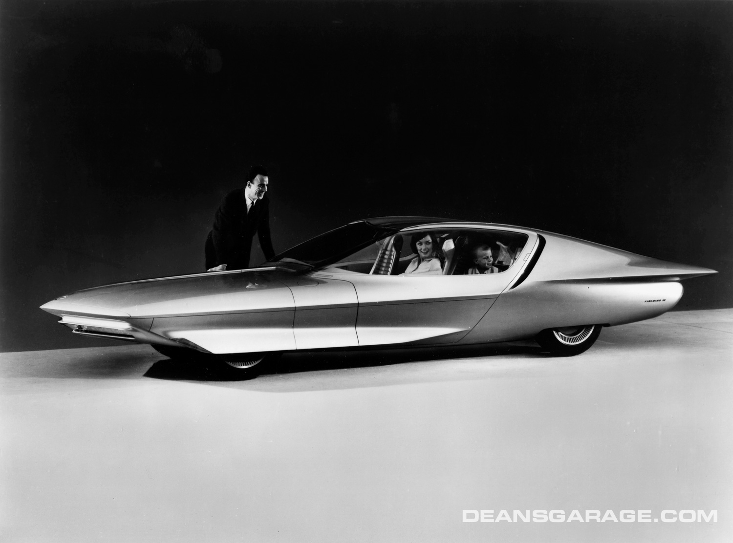
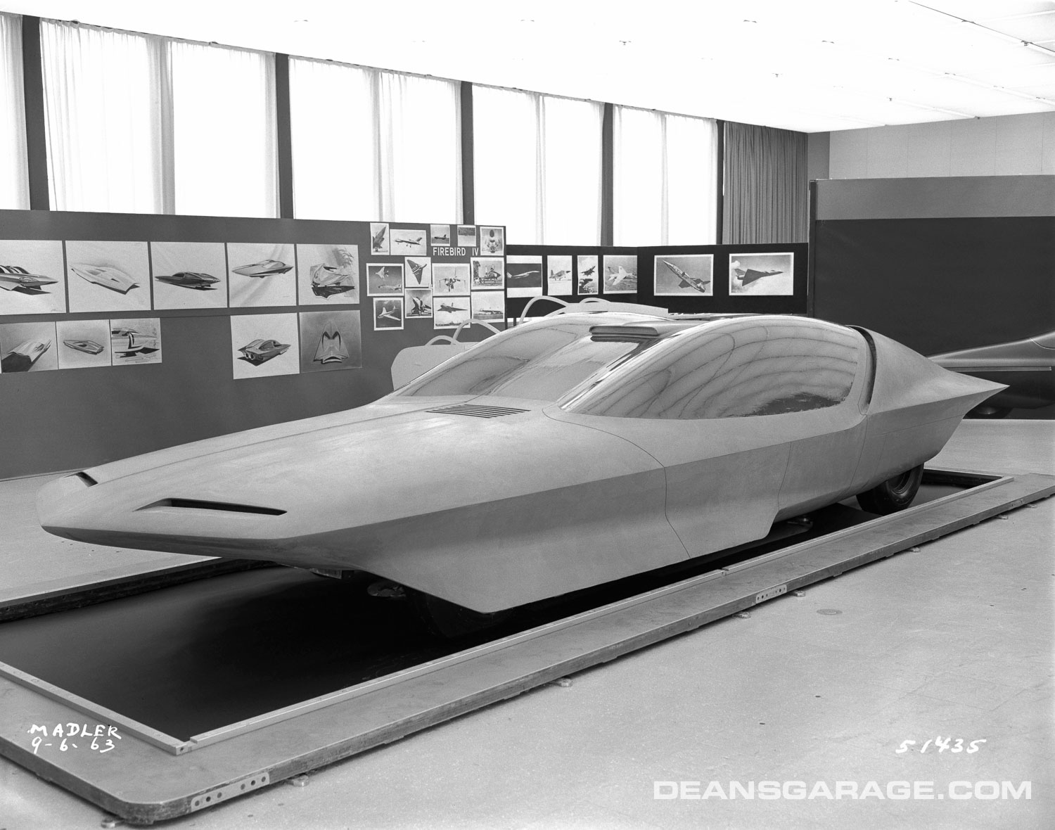
While the GMX and Runabout designs went smoothly, the Firebird IV got off to a rough start. We had gotten approval to proceed to full-size clay, and took the roughed-in model out to the patio for review.
I probably shouldn‘t have called Chuck and Bill out for the first look, but I did. I had made an error in judgment by adding some details to the model, like rendered taillights, scoops, etc., when the focus should have been on proportions and the basic theme.
I saw Mitchell quietly staring at the model and not looking happy. Finally he said, “(Expletive), that’s like putting lipstick on a hog.” Lesson learned. We retained the basic theme, and next time out we had a successful review.
We were informed about halfway through the program that all of the 1965 World’s Fair vehicles were going to be dummies, and not running vehicles. We were very disappointed, but decided to take advantage of that fact by lowering the overall heights about an inch to two inches to give them a sleeker profile. (Every designer perceived “lower” as better in those days.)
A problem arose, however, when I got a call from corporate Public Relations requesting that they come out to Design Staff to photograph the vehicles with live models, just prior to their being shipped off to New York.
I told them about cheating the height down, and that they had better find short people. I assumed they would probably abandon the idea of using models, but two days later the cars were completed and moved to the auditorium to be photographed. When the public relations people arrived, I went to the auditorium and couldn’t believe what I saw—perfectly proportioned, attractive, scaled down people; the tallest being a man about five feet, four inches.
Of the three cars, the GMX was Bill’s favorite. He never showed much interest in the Runabout. We all knew he disliked small, underpowered vehicles.
Photos: General Motors
Photos Courtesy of GM Design
Captions:
1. Bernie Smith, 1952. Photo: General Motors.
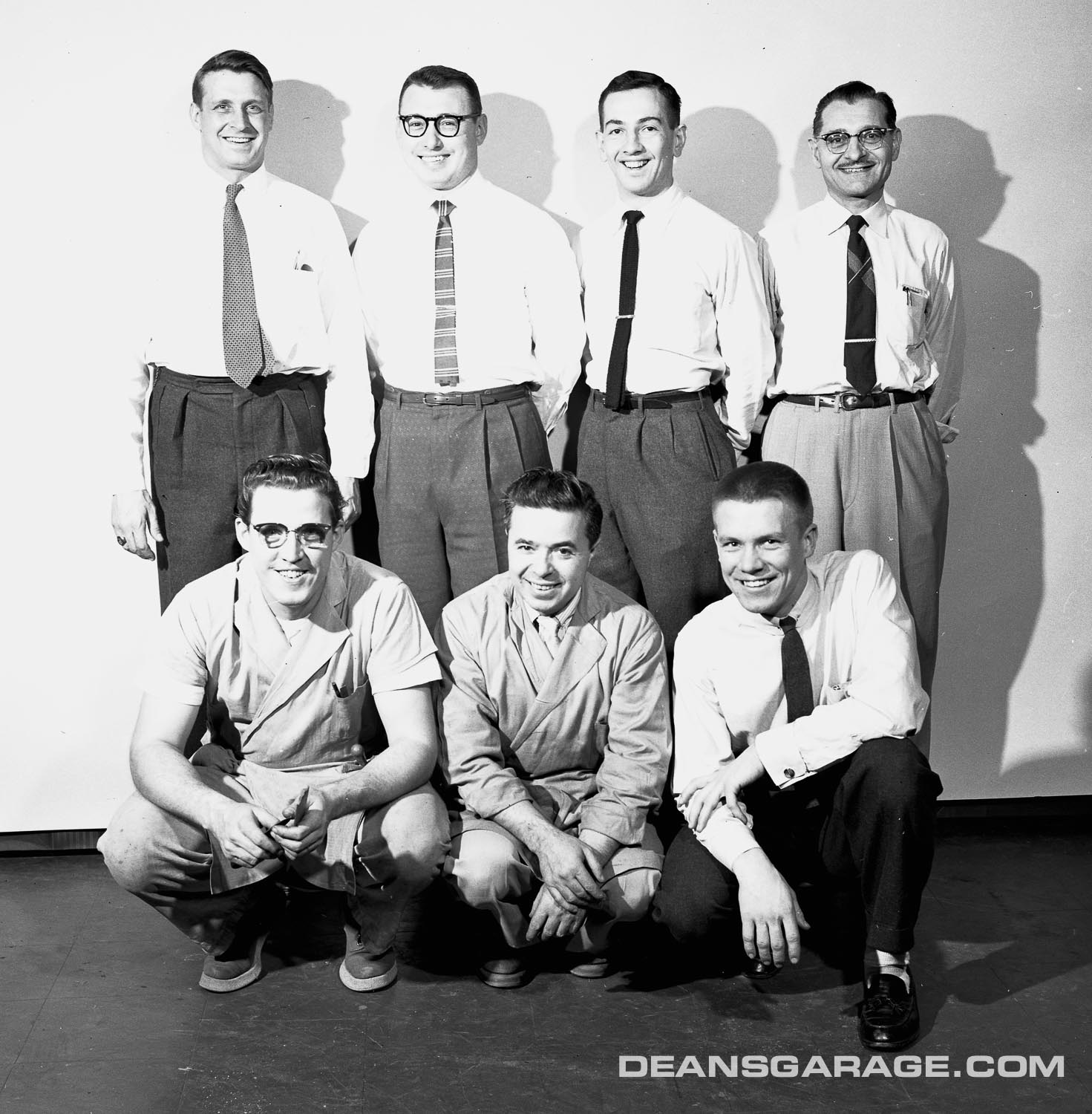
2. Oldsmobile Studio, 1955. Top Row: Don Hoag (Studio Assistant), George ?, Bernie Smith, and Frank Loeffler. Botom Row: Lenny Szeniak (Chief Modler), Billy Morganti, and Stan Mott. Photo: General Motors.
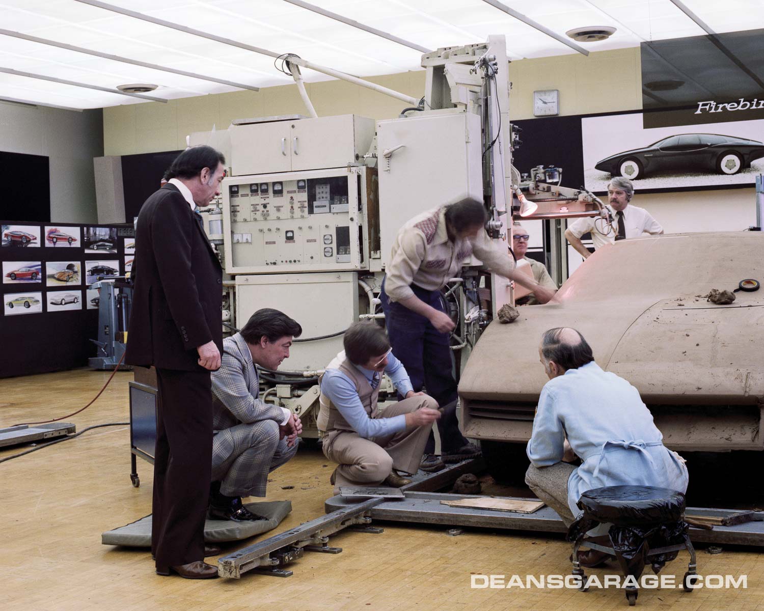
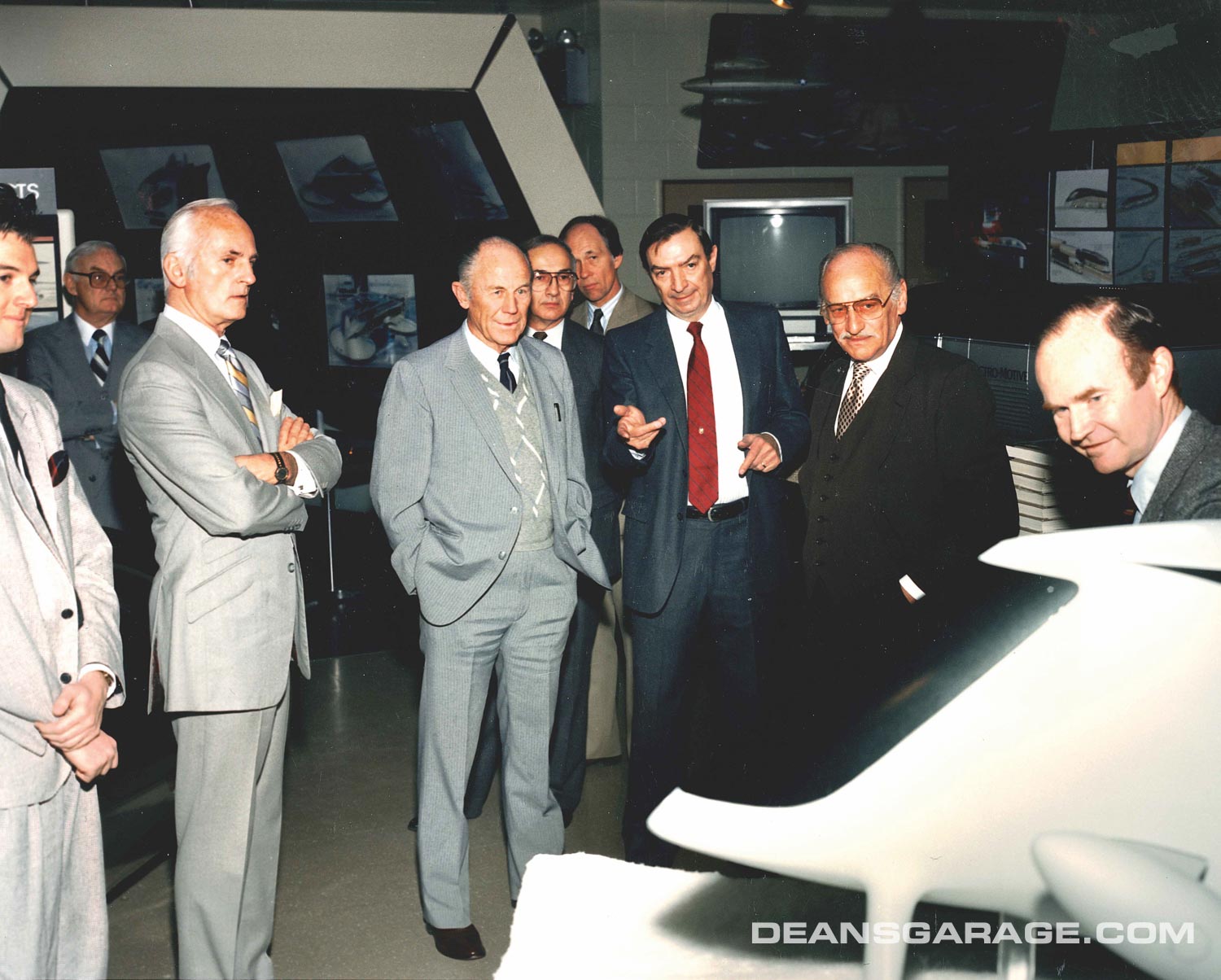
3. Chuck Jordan, Chuck Yeager, Bernie Smith, Don Schwarz, Stan Parker, Irv Rybicki, and Pres Bruning. Photo: General Motors.
4. Advanced Pontiac Studio: Berne Smith, Dave Holls, Roger Hughet, and Dave Rossi. The modeler might be Gary Staniec. Photo: General Motors.
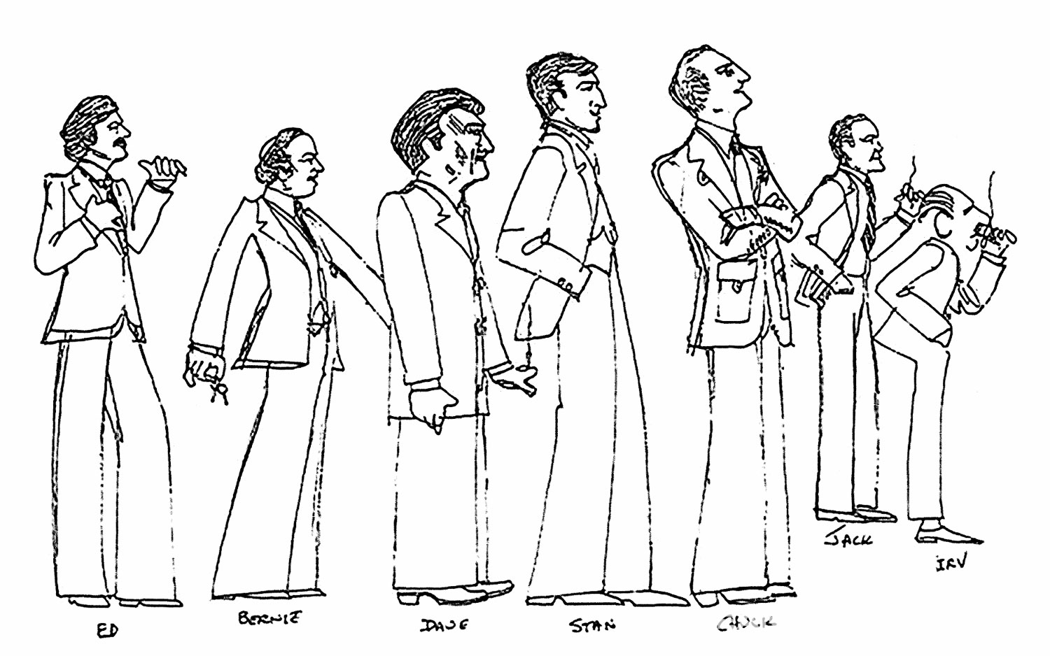
5. An incredible series of caricatures by Andy Hansel. He captured the gestures, poses, stances, clothing, and proportion perfectly. Pictured are Ed Taylor, Bernie Smith, Dave Holls, Stan Wilen, Chuck Jordan, Jack Humbert, and Irv Rybicki. Thanks to George Camp. Used with permission.


I first was introduced to Bernie’s talent on my first day at GM in January 1965, when his GMX was sitting in the Styling Lobby with Santa Claus inside. What a design. Fifty years later, he was a tremendous help for my book about Bill Mitchell, offering the fruits of his library with photographs, sketches, and notes about the design of the GMX.
Every time that I talked to him, he was either leaving for or returning from playing golf with his design buddies. Always a gentleman, he exuded an infectious positive energy.
He will be missed.
Very sad he is gone but sure liked reading about this amazing gentleman, thank you for doing this piece…
Trying to see the ’58 Olds without the “musical staff” or the ’58 Buick without the chevrons is mindbending after all these years. I’d love to see renderings of both cars with/without to see what they’d be like. As an aside, I’d also love to see a breakdown of whose idea it was to twin the Buick in ads with Convair’s B-58 Hustler. Got to be a good story there. There’s also a mystery here: Cadillac has been “celebrated” for years on its ’59 design, though it is one of my least favorites; but that ’58 combo of the Buick and the Olds set new geography for chrome, yet there has been little to no raving about that.
Excellent story Gary, it’s too bad he never was able to finish his autobiography.
Bernie will be remembered by those of us who worked with him as a breath of kindness and empathy in a sea of self serving, over zealous and sometimes maniacal top management. Announcing his entrance to a studio with no more than the jingling of keys in his pocket, he was always welcomed, not feared or resented.
Having spent quite a bit of time with him in these last 12 years of his retired life as a neighbor, I can attest that he continued this demeanor until the last year where his health was beginning to hamper his lifestyle. He loved to sit in his kitchen on some small steel and leather straight back “designer” chairs and read the morning paper and magazines, but when we (the caretakers he employed and I) tried to convince him he needed to get a recliner type chair so we could get his feet up to reduce swelling, he turned into a tyrant- “I don’t want any dam ugly thing like that in my kitchen, it won’t fit in with the rest of the design!”
Designer to the end…RIP BErnie, you will be missed.
A very beautiful and fitting tribute to Bernie. He was a true gentleman, talented designer, an inspiration and a dear friend. He will be greatly missed.
Bernie was truly a welcome figure to come by the studio. His GMX design was maybe the best GM show car ever. His time as head of Preliminary Design studio was very creative, also I understand where the ‘65 Cadillac was inspired. A great designer and terrific person.
Really enjoyed your tribute to Bernie. Although I never directly worked with him, I enjoyed and will always remember weekly golf outings with Bernie, “Russ”, and Dennis Burke.
Nice job, as usual, Gary!
Ron
A fine tribute to really good man, Bernie was my first Boss after design development, and I had the highest respect for him as a boss and as a designer. Gary, every thing you said about Bernie is true. I talked to Bernie a couple weeks before his passing and he sounded tired but he still had the desire to do things and to talk about good times at Design. He will be remembered as a great mentor and friend to many of us who had the good fortune to have worked with and for him. Wayne Kady
A great tribute to a very good designer and human being. He was my boss in preliminary design studio working on the world’s fair cars. Many years later we enjoyed his visits to Arizona each winter. He will be missed.
Dave Jenkins, head of Edsel’s marketing staff at Foote, Cone & Belding in Chicago, had his his own clever vocabulary of pet names for offensive contemporary car styling. Some of his favorites:
1962 Mercury: highway flares atop the rear fenders
1958 Oldsmobile: banjos mounted on the quarter panels
1957 Mercury Turnpike Cruiser: lollipop in the rear window
1958 Mercury: something you blow into and music comes out
1958 Buick Roadmaster: big chrome shovels on the sides
Don’t worry, Dave also appreciated the many jokes about the Edsel. But he agreed with Roy Brown, the car’s designer, the vertical grill was reminiscent of many of the more stylish cars of the 1930s.
Thank you for the fine tribute to Bernie Smith. As someone who cannot draw a straight line with a ruler, I stand in awe of those artists and designers who’s creative visions were and are translated into metal and glass (and now today, composite materials).
I think that we consumers fail to realize that the designs that make it into production are the results of decisions made by committees at sometimes several levels. (I spent most of my life working in broadcasting and the adage is that everybody is a program / music director. I know from my late father’s comments that it is true of General Motors.) Today, the cars of 1958 through 1963 look a bit different to my eyes than they did when I was a youth. The clean, graceful 1957 Oldsmobiles and Buicks, with their details previewed in the Motorama show cars, became more baroque, in an effort to increase sales, in a time of economic downturn that most did not see coming when the cars’ designs were being finalized in 1956. Are there any automotive designs that were the result of the “pure” design vision of the creator ?
James E. Duvall asked, “Are there any automotive designs that were the result of the “pure” design vision of the creator?”
Yes! Here are a few universal examples:
1956 Lincoln Premiere
1960 Ford Falcon
1953 Studebaker Starliner
1967 Mercury Cougar
1960 Ford Starliner
1954 Mercury Monterey
1957 Dodge Custom Royal
1955 Plymouth Belvedere
1963 Chevrolet Impala
1957 Ford Fairlane 500
1956 Pontiac Star Chief
1957 De Soto Firedome
1967 Chrysler Imperial
1970 Chevrolet Camaro
1957 Oldsmobile 98
1965 Buick Riviera
… just to name a few.
Your tribute to Bernie was excellent! You really displayed what a talented artist he was! Did you also know he was a fine watercolor artist also?
Bernie was married to my sister who died of an extended bout with cancer.
He was always at her side to the end! Thank you honoring Bernie!