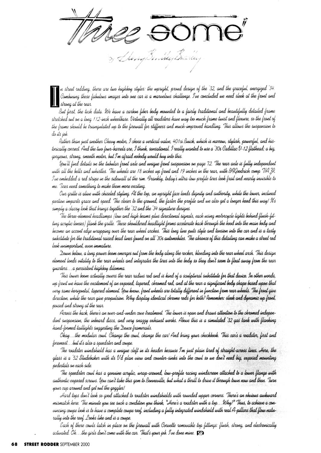
Threesome
By Harry Bentley Bradley
Street Rodder, September 2000
In street rodding, there are two highboy styles: the upright, proud design of the ’32, and the graceful, energized ’34. Combining these fabulous images into one car is a marvelous challenge. I’ve concluded we need sleek at the front and strong at the rear.
But first, the tech data. We have a carbon fiber body mounted to a fairly traditional and beautifully detailed frame stretched out on a long 112-inch wheelbase. Virtually all roadsters have way too much frame twist and flexure, so the front of the frame should be triangulated up to the firewall for stiffness and much-improved handling. This allows the suspension to do its job.
Rather than just another Chevy motor, I chose a vertical-valve, 401ci Buick, which is narrow, stylish, powerful, and historically correct. And the two four-barrels are, I think, sensational. I really wanted to use a ’30s Cadillac V-12 flathead; a big, gorgeous, strong, smooth motor, but I’m afraid nobody would buy into this.
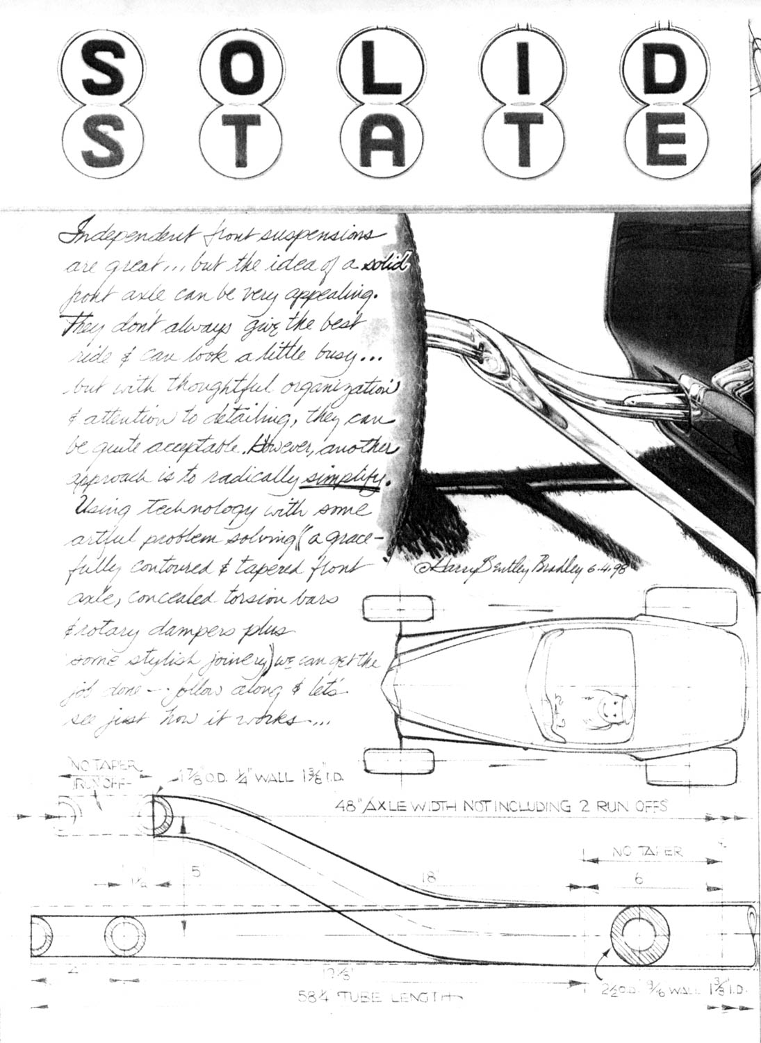
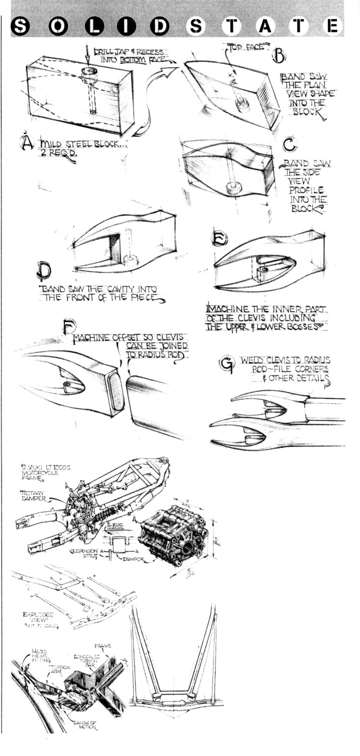
You’ll find details on the tubular front axle and unique front suspension on page 72. The rear axle is fully independent with all of the bells and whistles. The wheels are 18 inches up front and 19 inches in the rear, with BFGoodrich Comp T/A tires. I’ve embedded a red stripe in the sidewall at the rim. Frankly, today’s ultra-low profile tires look frail and early invisible to me. Tires need something to make them more exciting.
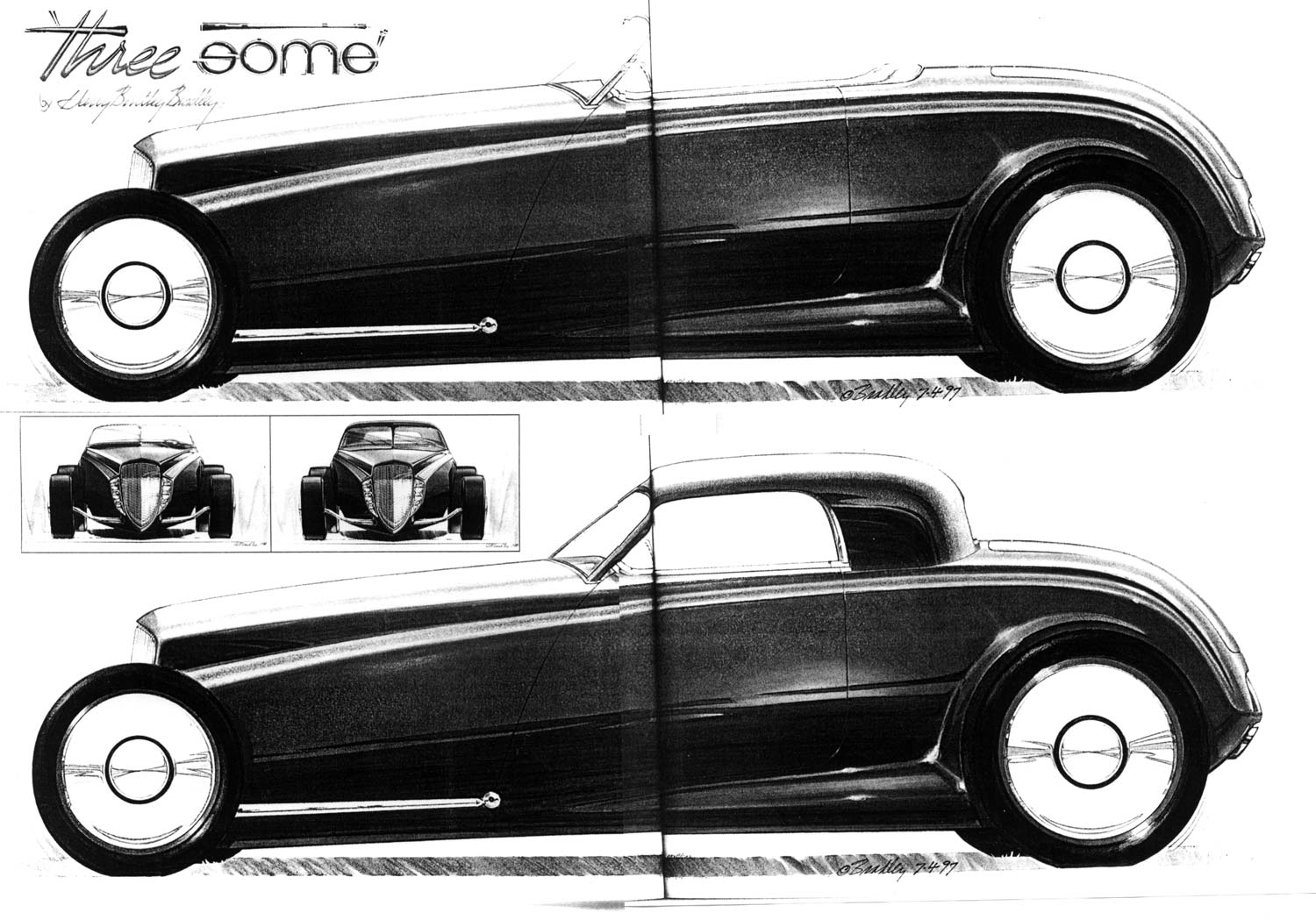
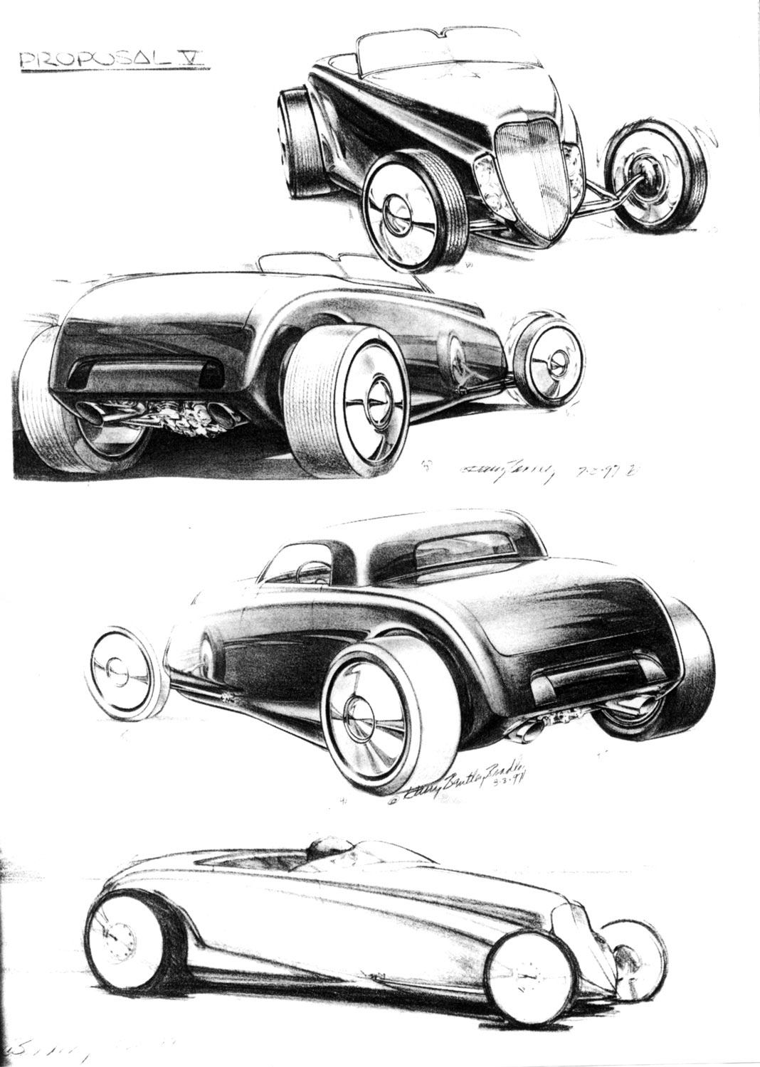
Our grille is alive with chiseled styling. At the top, an upright face lends dignity and authority, while the lower, inclined portion imparts grace and speed. The closer to the ground, the faster the profile and we also get a longer hood this way! It’s simply a classy look that brings together the ‘32 and the ‘34 signature designs.
The three-element headlamps (low and hight beams plus directional signals, each using motorcycle lights behind flush-fitting acrylic lenses) flank the grille. These shouldered headlight forms accelerate back through the hood into the main body and become an accent edge wrapping over the rear wheel arches. This long line puts style and tension into the car and is a tasty substitute for the traditional raised bead lines found on all ‘30s automobiles. The absence of this detailing can make a street rod look unimportant, even immature.
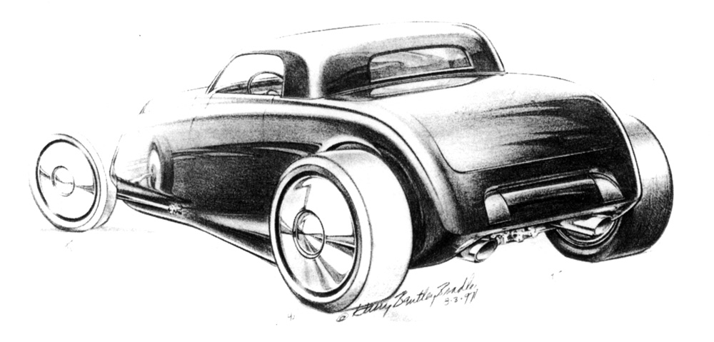
Down below, a long power boom emerges out from the body along the rocker, blending into the rear wheel arch. This design element lends vitality to the rear wheels and integrates the tires into the body so they don’t seem to float away from the rear quarters…a persistent highboy dilemma.
This lower boom actually covers the rear radius rod and is kind of a sculptural substitute for that device. In other words, up front we have the excitement of an exposed, tapered element. You know, front wheels are totally different in function from rear wheels. The front give direction, while the rear give propulsion. Why display identical chrome rods for both? Remember: sleek and dynamic up front, poised and strong at the rear.
Across the back, there’s an over-and-under cove treatment. The lower is open and draws attention to the chromed independent suspension, the inboard discs, and very snappy exhaust works. Above this is a simulated ‘32 gas tan with flanking hand-formed taillights suggesting the Duce framerails.
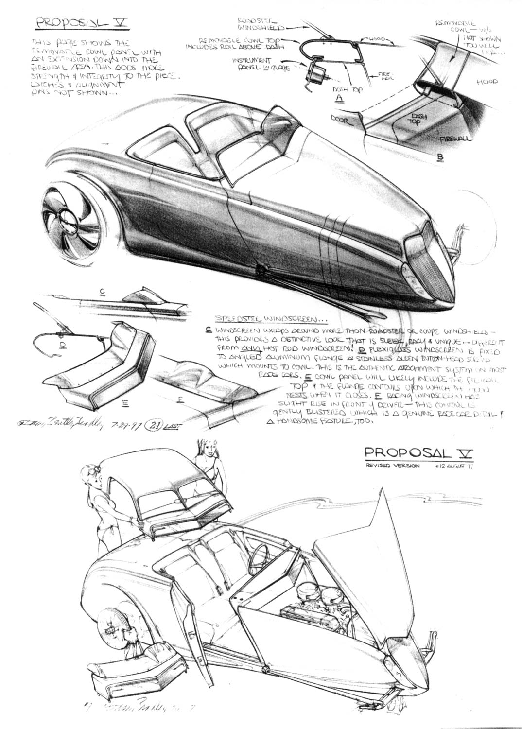
Okay…the modular cowl. Change the cowl, change the car! And bring your checkbook. This car’s a roadster, first and foremost…but it’s also a speedster and coupe.
The roadster windshield has a unique cleft in its header because I’m just plaing tired of straight-across lines. Here, the glass is a ‘52 Studebaker with its V’d plan view and counter-sinks into the cowl so we don’t need big, exposed mounting pedestals on each side.
The speedster cowl has genuine acrylic, wrap-around, low profile racing windscreen attached to a lower flange with authentic exposed screws. You can’t take this gem to Bonneville, but what a thrill to drive it through town now and then, Turn your cap around and get out the goggles!
Hard tops don’t look so good attached to roadster windshields with rounded upper corners. There’s an obvious awkward mismatch here. The minute you see such a condition you think, “Here’s a roadster with a top…why?” Thus, to achieve a convincing couple look is to have a complete coupe roof, including a fully-integrated windshield with real A-pillars that flow naturally into the roof. Looks like and is a coupe.
Each of these cowls latch in palace on the firewall with Corvette removable top fittings: flush, strong, and electronically activated. Oh…the girls don’t come with the car. That’s your job. I’ve done mine.
Postscript: I was fortunate to have Harry Bradley as an instructor at while attending Art Center. See other Dean’s Garage posts featuring Harry Bradley.—Gary

As always, a lovely proposal from a Master!
Looks like the Prowler Revisited, albeit more traditional. The comments about awkward corners and such are so true, yet he provides a nice alternative.
Really inspirational sketching and design!
Thanks!
The comments about tires and wheels are so true. Rubber band tires look silly and are really useless, in the real world of pot holes and bad pavement. The only thing worse are air-bagged cars that look like the springs broke. The entire idea of bags is to get the vehicle at “Design Height”, NOT on the ground!
All of the repop red and blue line tires are poor relations to the originals, that had the lines much nearer to the tread!
Glad to see another view of rods. The Prowler designers were given the ’34 and ’37 Fords as the hot state of the art, before they really did it. Somehow, they saw Henry Hirise cartoons and packaged the people as just peeking over the belt line, eliminating the best part of roadster driving- hanging your arm over the side, in the breeze!
Is the great Harry Bradley still with us?
According to Wikipedia he is.—Gary
I went to a party once at Harry’s house, and we worked together once for about three months on the Nova. Very interesting guy.
He was very creative with a great sense of humor. I remeber a piece he did for a Porsche magazine (can’t remember which) on “Porsches of the future”. He did a sketch of a future 911 with tree branches reflected in the windshield. When you turned the image upside down, the reflection of the tree branches read, “This is all BS”. I cleaned it up a bit.
Harry has always had a interesting sense of humor, and many times uses his sketches to “reflect” that! Particularly true on sketches of Chrysler products that he would do for sneak peek magazine articles.
Many years ago at the 3rd Str. ACCD his classes were always interesting!
 DFO
DFO
Fascinating! One minor thing: The 1930s Cadillac V-12 was an OHV engine, not a flathead.