Design: LeSabre gets new look, but still says Buick
Published in Inside Buick magazine, Spring 1986
by Rick Sand
 Where does the design for a new car, such as the 1986 LeSabre, actually come from? Do engineers sit at computer consoles and design it from mathematical concepts? Do Buick marketing people ask consumers intricate questions about what they prefer and go from there? Do Buick designers dream and draw and then sculpt models to make their statements of what a LeSabre should be?
The answer to all of the above is yes.
The engineering and marketing of the LeSabre are simultaneous processes that involve a host of principal players.
Buick engineering product line managers present design specifications they have developed in part by using data from corporate product teams. Proposals are screened by General Manager Donald E. Hackworth and Buick Chief Engineer David S. Sharpe, who carefully pore over specific vehicle features, engine configurations and total packaging.
This engineering and marketing input is coordinated with Buick design studios by Ronald Kruchten, Buick design staff liaison manager. He regularly organizes design staff reviews, in which Hackworth examines car designs in progress and “signs off” cars he deems ready for production.
Responsibility for the LeSabre’s “look” falls on three design studios, which are located with the other divisional studios in the Design Center Building at the General Motors Technical Center in Warren.
Buick Studio No. 1 is responsible for exterior surfaces of senior-series cars—Riviera, Electra, LeSabre. Buick Studio No.2 designs Regal, Century, Skylark, Somerset and Skyhawk. Due to work loads, these assignments are not rigidly enforced. Occasionally Buick 1 will do a smaller car or Buick 2 a larger one. A third studio does interior designing for all of the Buick model lines.
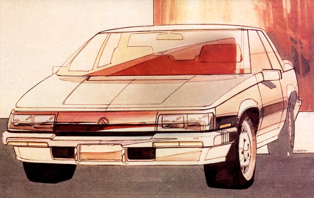
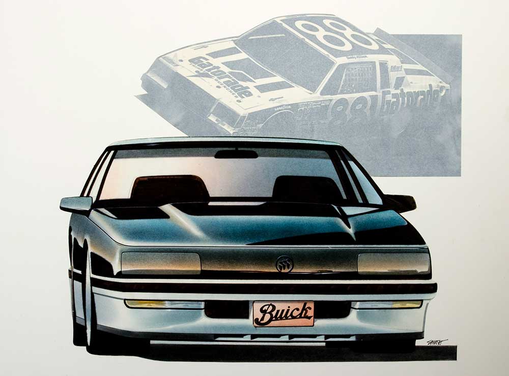
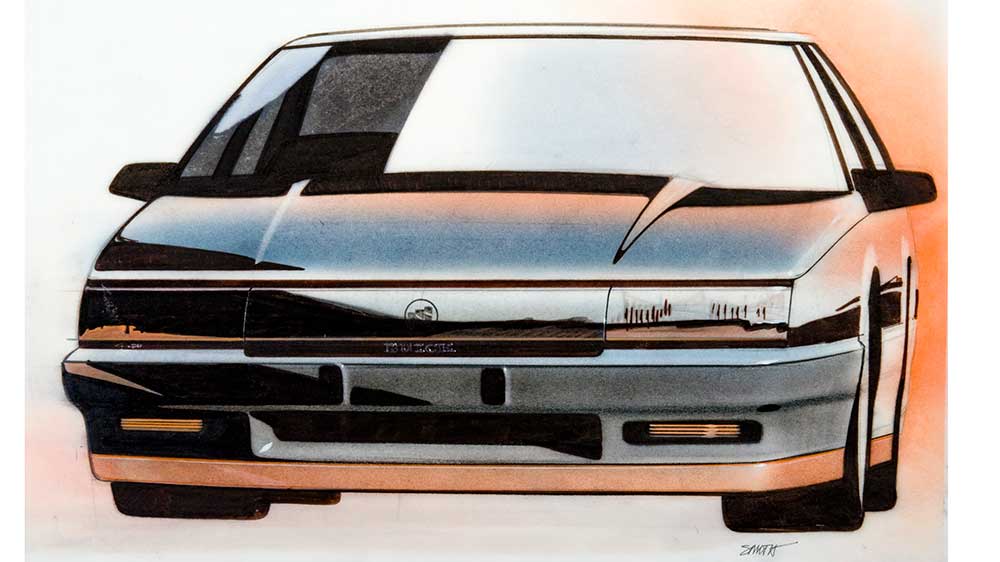
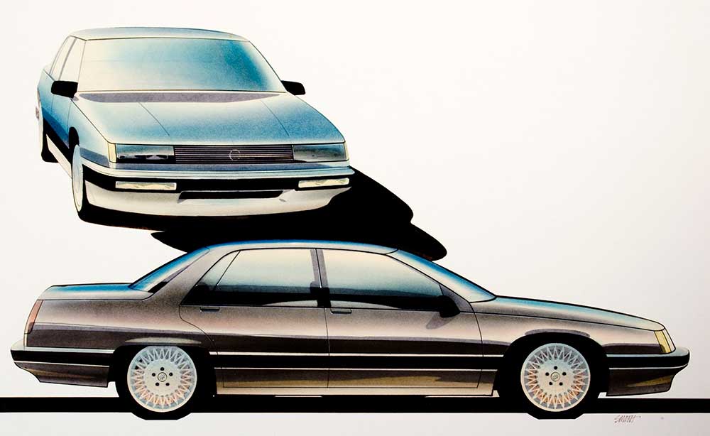
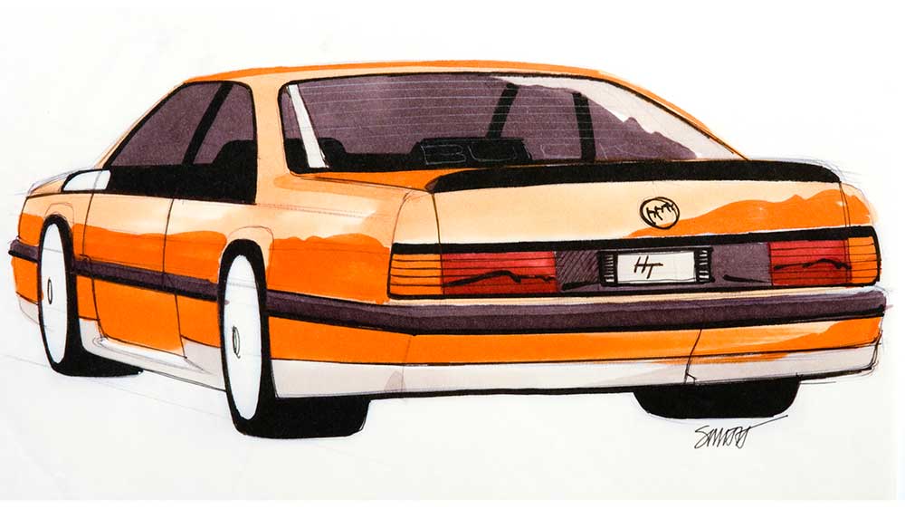
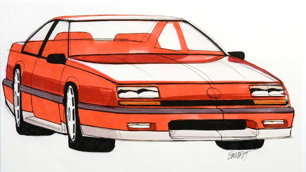
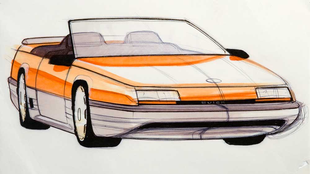
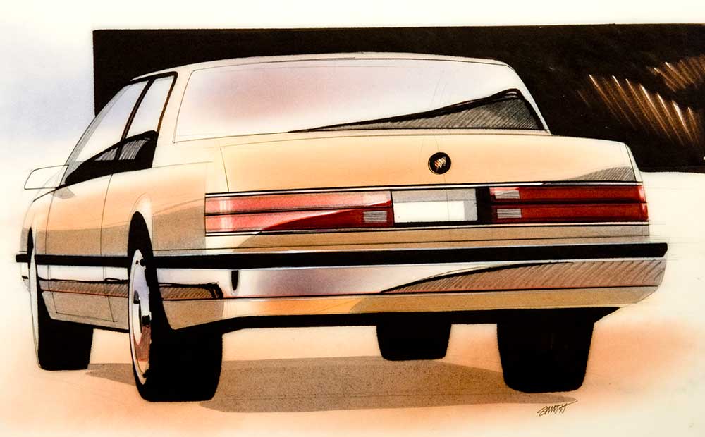
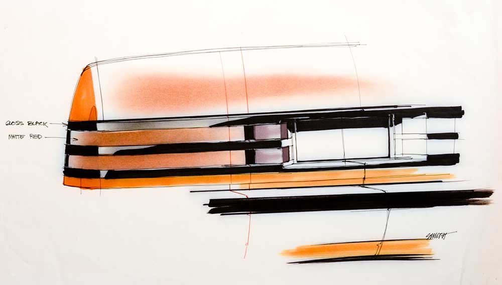
Bill Porter, chief designer of Buick 1, and Gary Smith, designer (now with another studio), were heavily involved in the LeSabre project. At the time work began on the new LeSabre “H” car in late 1979 (the rear-drive LeSabre was on the “B” body), a new level of efficiency was expected of all cars because of the international oil crisis that meant high gas prices.
Lighter weight, better aerodynamics and more efficient V-6 engines would be part of the package. So would front-wheel drive. Porter said that configuration helped the designers reach their goals of removing hundreds of pounds of mass, while allowing six people to ride comfortably in a large passenger compartment.
“This was to be a big American sedan—a full sized car—yet we had to get the fat out,” Porter said.
“The efficiency we wanted had to be achieved within those constraints. We wanted to maximize interior room because you can make cars smaller, but you can’t make people smaller.”
Work on the car started under Porter’s predecessor, Jerry Hirschberg. He was assisted by designers Ted Schroeder and Gary Smith. Porter took Hirschberg’s place in 1980 as head of Buick 1.
“When I came in, there was already a direction started. Ted and Gary had done a good bit of work on the car. I simply picked it up and amplified it. It went on from there,” said Porter.
Going on from there included the packaging design for the new car. A unique Buick identity had to be built in as well. Porter said a “Buick look” is many things.

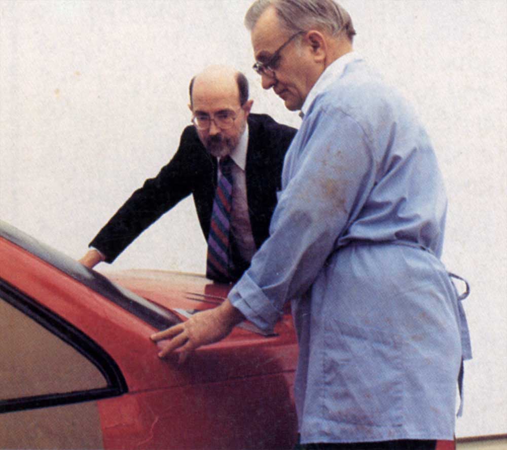
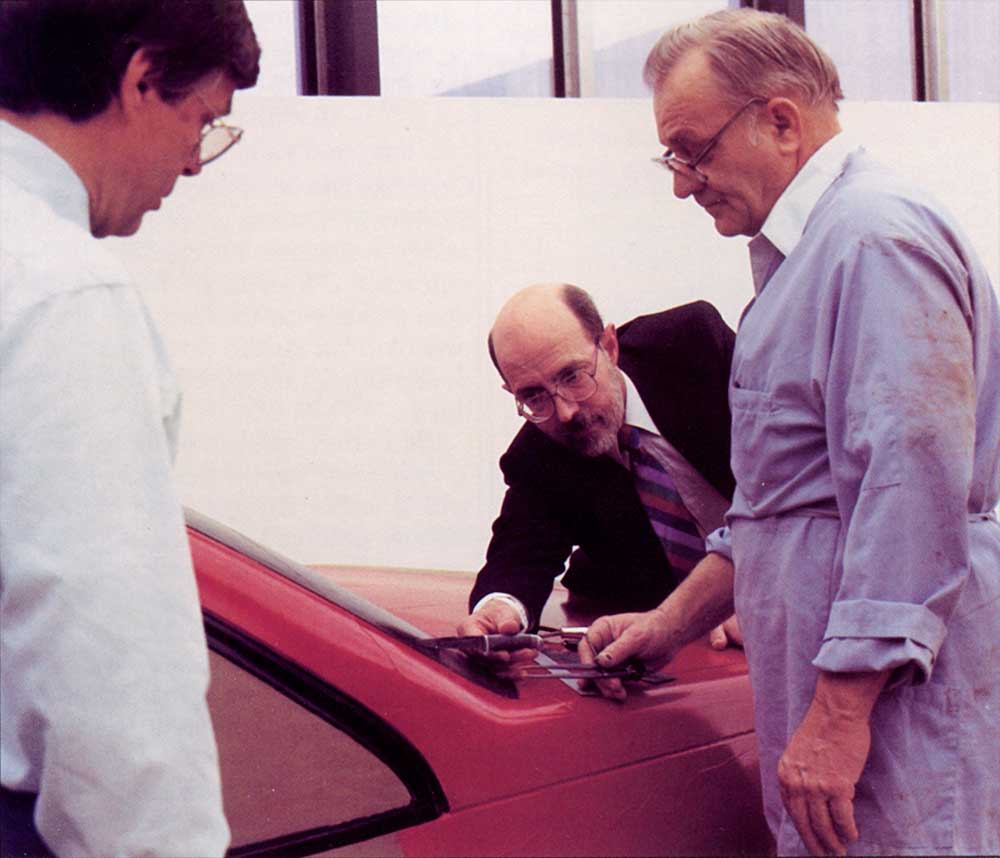
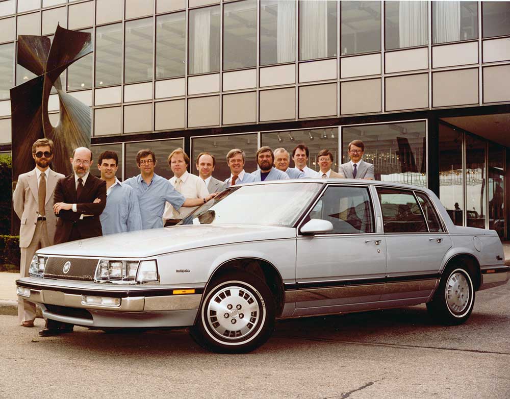
Bill Porter, Ivan Koop
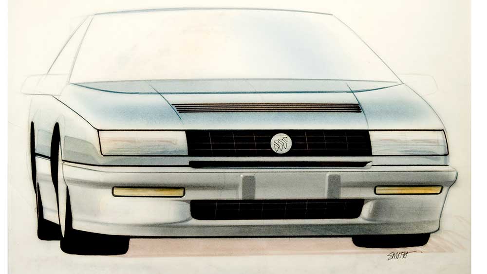
“At the most obvious level, you need recognizable visual cues such as a ‘Buick face’ front end or horizontal tail lamps. But we also have a constant dialogue with Buick marketing people in terms of our image. We try to cater to the markets we believe are there for our products. As to the ‘Buick look,’ I try to make sure we put slightly huskier forms in our cars. We don’t want them to look fat, heavy, thick or dull. We want them to be just a little more muscular than average—I guess more substantial might be the right word.”
This “Buickness” is tempered to be a little more conservative or daring, depending on the model. The LeSabre has a more youthful appeal than an Electra—which is more traditional—as a result of this type of planning.
Said Smith: ‘Although we share some components with other divisions, my thought is to make a Buick contemporary and progressive. We try to make a design statement from the ground up.”
This effort is apparent when looking at a LeSabre and its features.
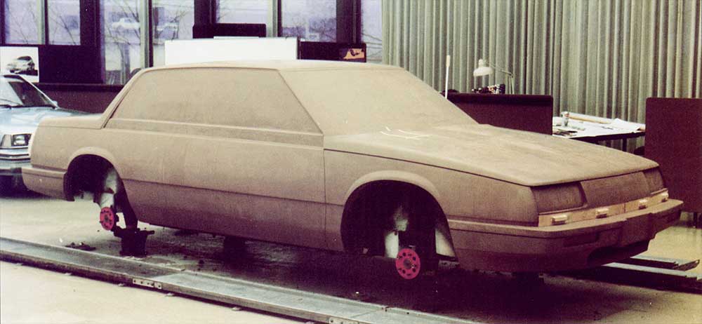
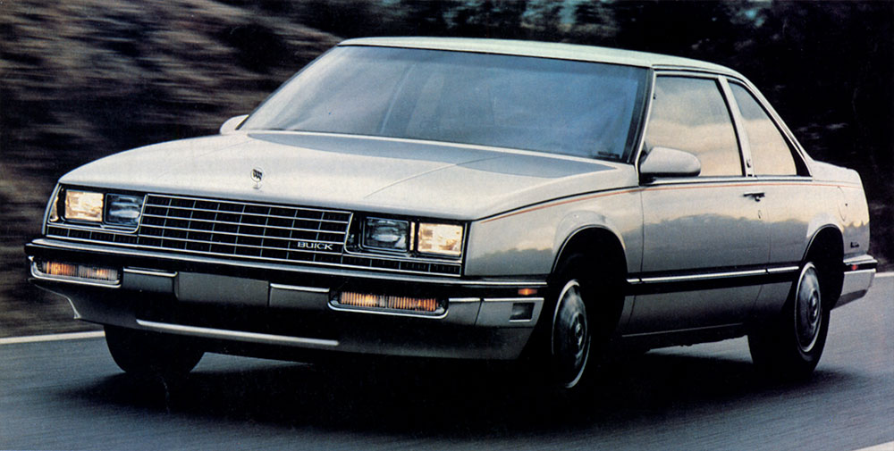
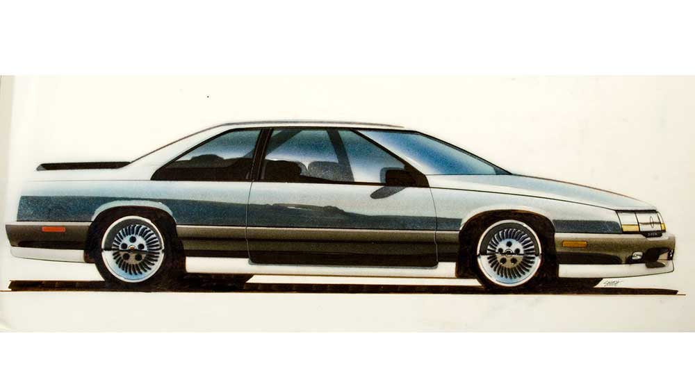
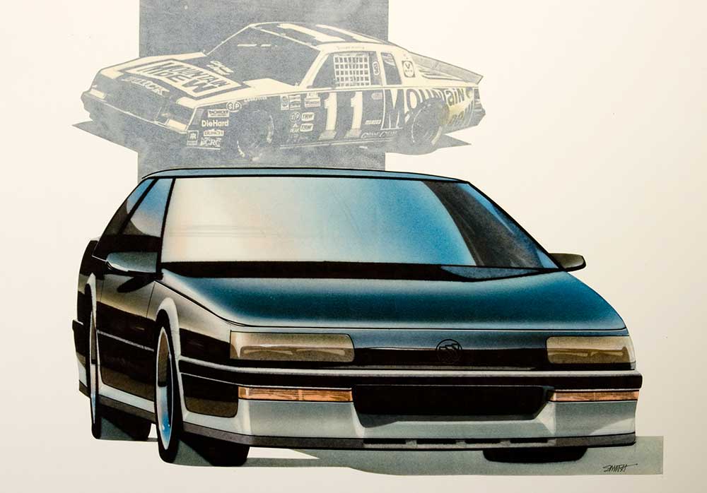
One well-received styling feature is the fastback roofline of the two-door, which sets it apart from the more formal look of the four-door. Buick advertising emphasizes: “The return of the great American coupe.” The two-door and four-door originally were to share the same glass and roof panels.
“The original program called for that interchangeability and that was okay in that it spelled efficiency.”
But the H-car program was delayed. It was decided to introduce the larger C-bodied Electra first. The Electra featured the sharing of roof panels. Sales of the two-doors shrank in comparison to four-doors.
“Because of the delay in the H-car program and this data coming in, it was possible to design a new roof starting virtually from a brand new panel,” said Porter.
Once the constraints of having to use a sedan roof panel were removed, it was possible to design a windshield at a slightly steeper angle to take better advantage of the aerodynamics of the fastback design. Those wind-tunnel advantages haven’t been lost on NASCAR racers either, and LeSabre coupes will be seen on many stock car tracks in the 1986 season.
Another feature of interest on the LeSabre is the “clam shell” hood panel. It wraps around the edges of the front fenders and when opened, tilts forward and up. This gives better access to the engine and other underhood components. Smith noted that originally this feature was proposed for the rear decklid of the car as well.
“We thought that would be just dynamite, but the problems of hinging the deck and the cost of manufacture ultimately prevailed.”
The hood—shared with the Electra—is a functional touch exclusive to Buick within GM.
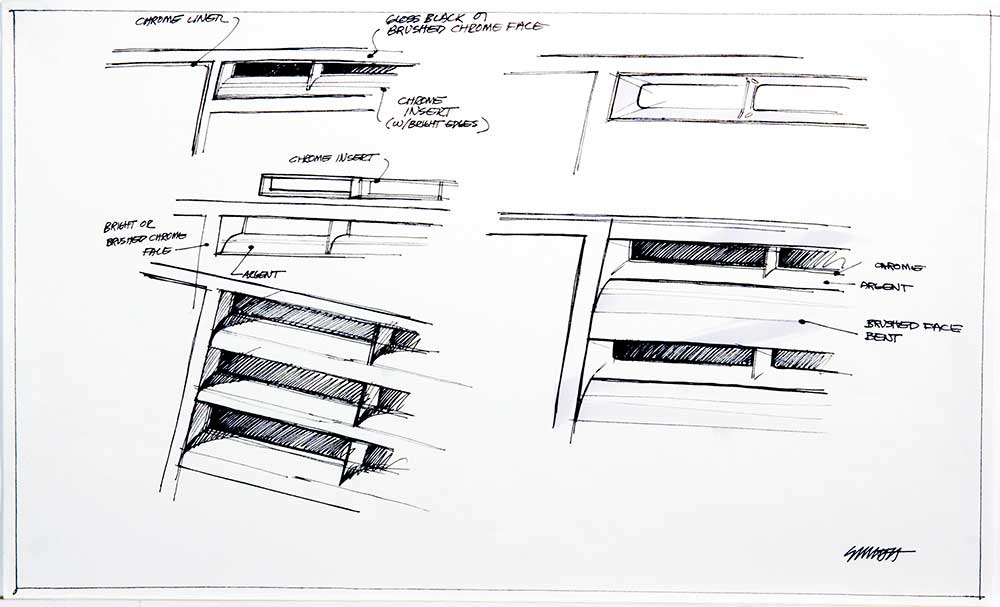
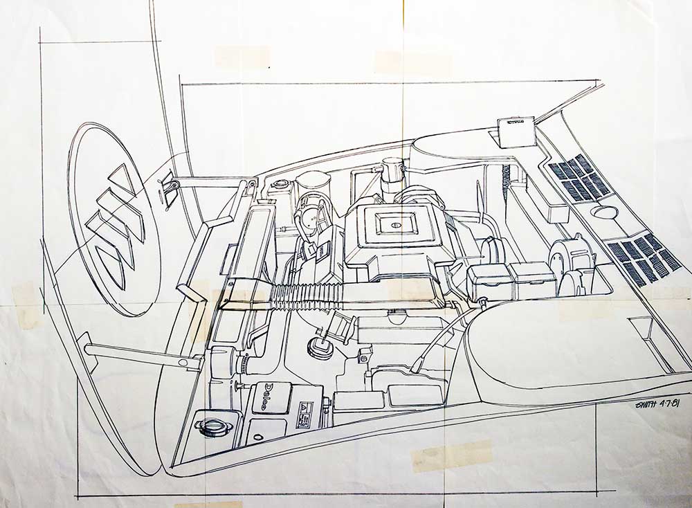
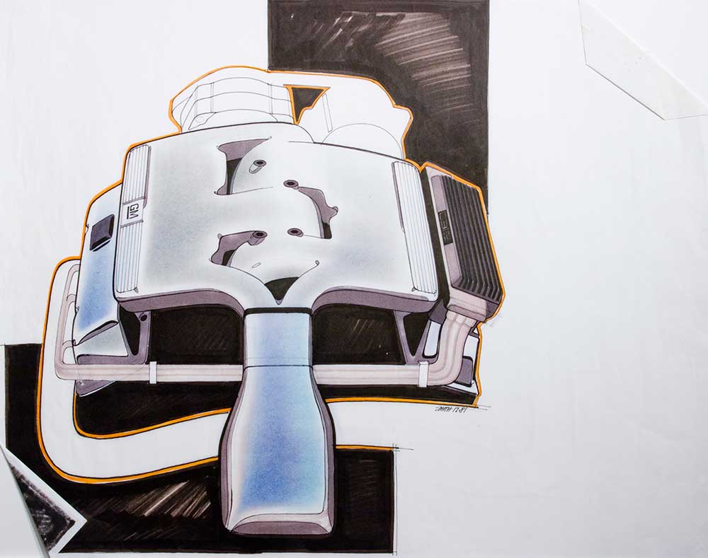
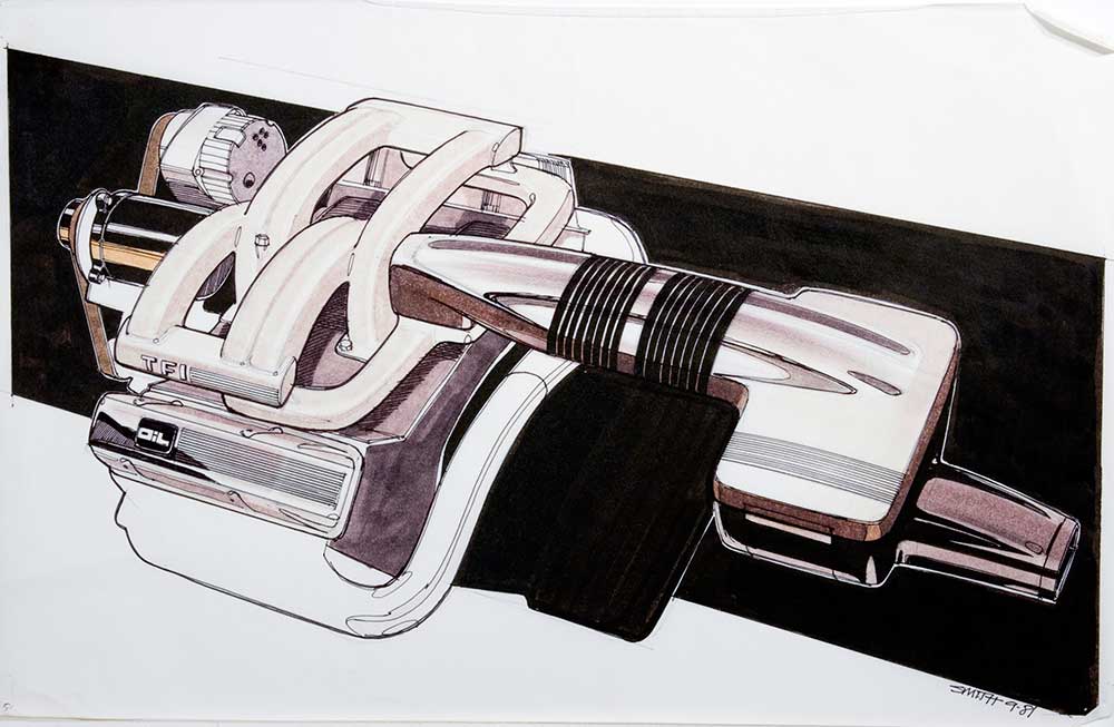
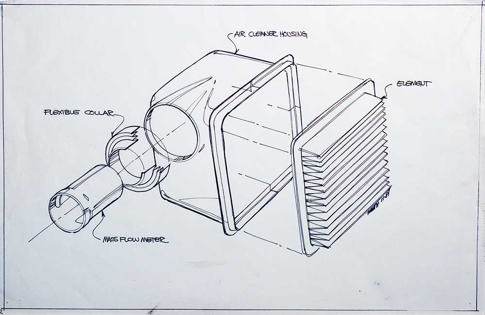
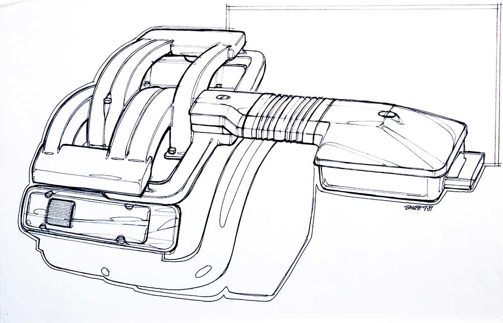
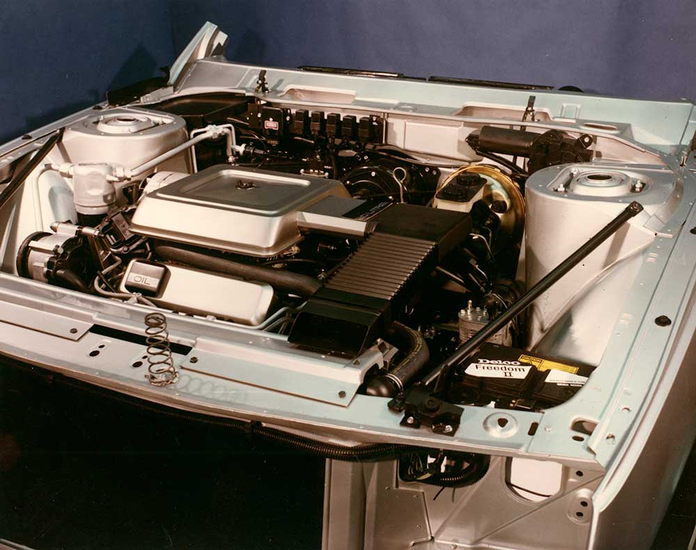
In the past, these designers stopped when they completed the outer surfaces of the car. Not true with LeSabre. Porter and his team decided to carry their design expertise under the clam shell hood as well. They wanted to try to organize and clean up the myriad of hoses, wires, fasteners and other components that are spread out in an engine compartment.
“Gary really did the service on that. He poured many, many weeks and countless extra hours of his time in dealing with a great many people with particular areas of detail responsibility under the hood,” Porter said.
Smith worked with Roland Pesik from the GM Project Center along with Stan Fowler, Buick C/H platform program manager at that time. The GM Project Center was an advanced engineering planning group which utilized the services of people from each of the divisions involved with a platform—such as an “H” car.
Since the corporate reorganization in 1984, these duties are now handled by specific teams, the Flint Product Team being one example. Smith, Pesik and Fowler did much of the initial work on organizing the engine compartment. Their efforts were later enhanced by Donald Runkle, Buick assistant chief engineer—Powertrain from 1982–1984 and his work with engine dress.
It was a pioneering effort within the corporation that caught on. These newly organized engine compartments can now be seen on many new GM cars.
Porter was asked what is in store for the LeSabre now that it is in the marketplace.
“We hope the car has a nice long healthy run. There will be some detail changes coming up which we are very happy with. Most designers around here are not in favor of changing a design just for the sake of change—that smacks of the 1950s and 1960s. A change has to be an improvement.
“Otherwise you’re just gilding the lily.”

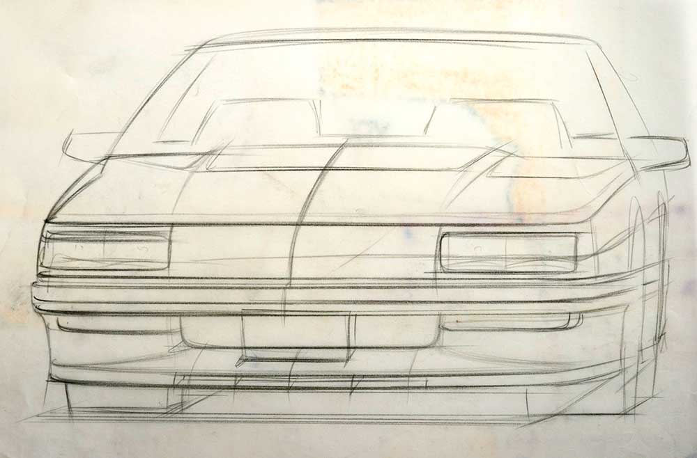
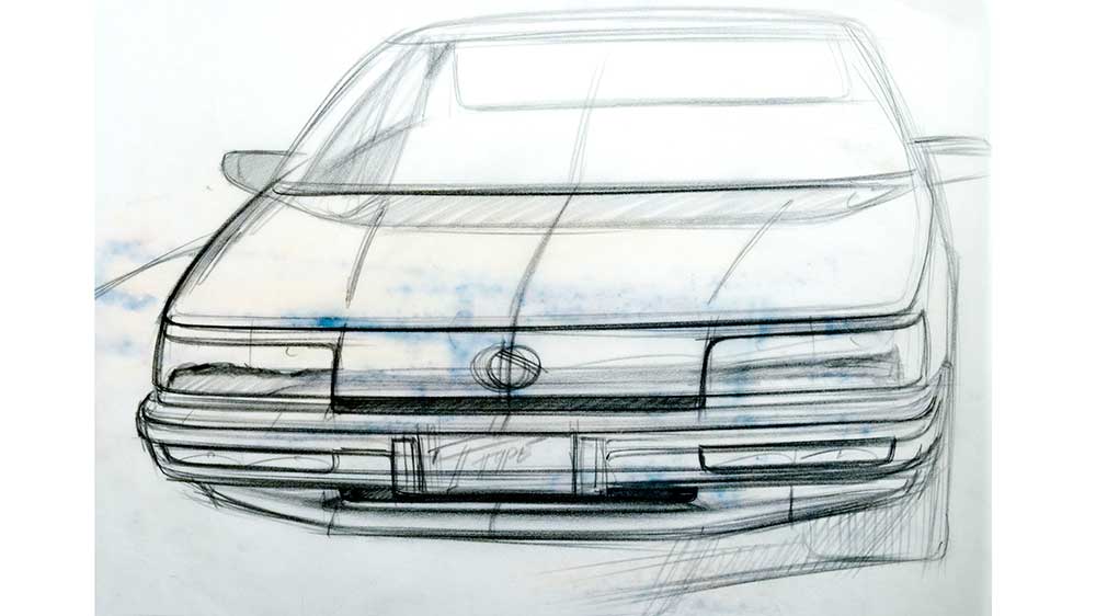
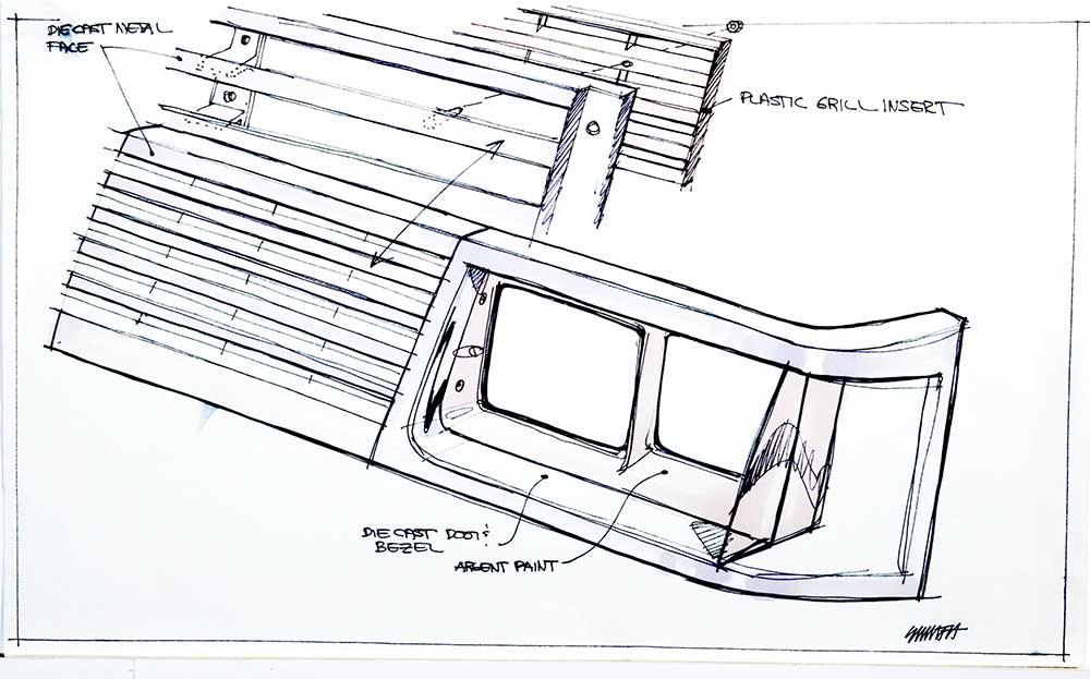
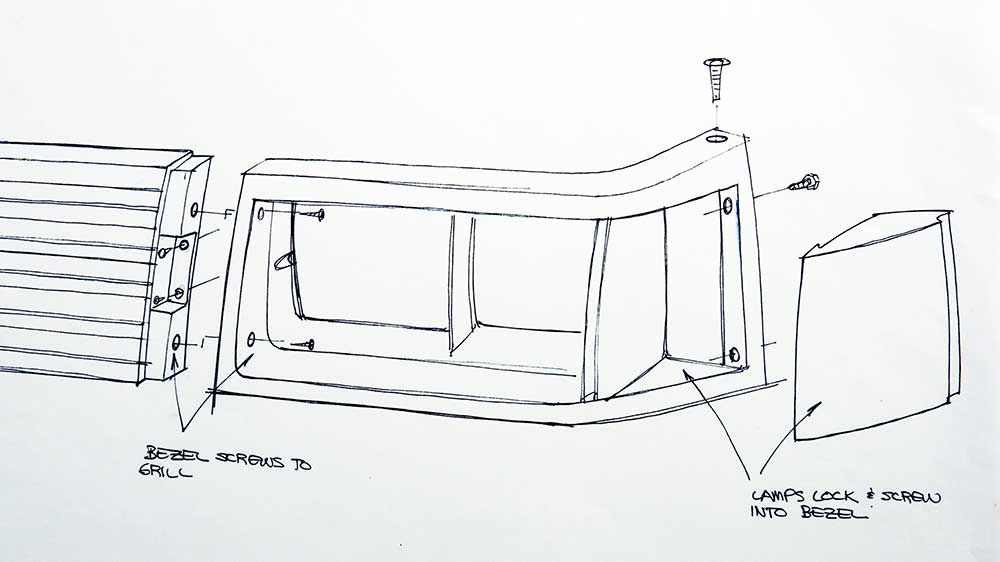
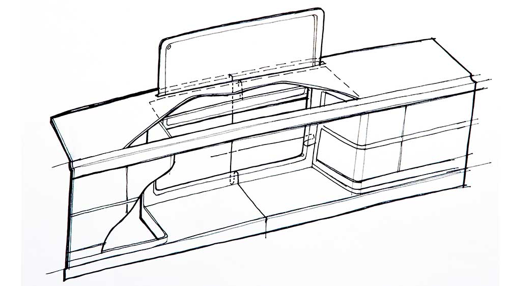
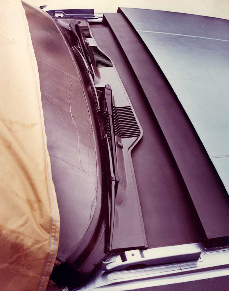
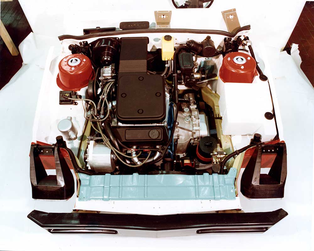
The clamshell hood idea was first seen on the Saab 96 and further refined on the 99/900 models. Probably not a coincidence. I am not familiar with the car but it doesn’t look like they swiped the idea of the hooks at the rear edge to prevent the hood from coming through the windshield in the event of an accident.
Have really enjoyed DEAN’S GARAGE over the last few years Gary, and was pleasantly surprised to see my old article on the LeSabre from Inside Buick.
Interviewing Bill Porter was a treat. Of all the GM executives I dealt with in my time producing the magazine, Mr. Porter is the one who really stands out in my memory. What a class guy. As a studio chief, he was obviously one of Design Staff’s more important figures—but I’ve never met someone more gracious with his time.
Also recall that after meeting him in the lobby and walking upstairs to the Buick I studio, he wouldn’t start the interview until he’d called you and another designer in to provide your input. He was very proud of your work on the car and wanted to make sure credit was given where it was due.
At the conclusion of the interview, he asked if I’d like a tour of the facilities and proceeded to show me around several of the areas that weren’t off limits. I remember being really impressed with a gallery filled with paintings and sculpture. “These were all done by the folks in this building,” he stated, “You know, we have some of the finest artists and designers in the world here.”
When we came back downstairs, there was a new 1986 Riviera on display in the lobby and he stopped in front of it. “What do you think of it?” he asked.
As you recall, here was a vehicle that had to follow one of the most successful Rivs ever done—one of the last cars designed under Bill Mitchell—which was gorgeous, flamboyant, beautiful—all the superlatives the best Rivieras had always owned. This poor ’86 was a shrunken version of its former self, done in panicked management response to a forecast of hyper-expensive oil that never happened. The package had been foisted on Design Staff who had little to work with. Sales were in the tank.
Now, the head honcho of the group who’d designed this thing was asking what I thought of his work (!).
I was as diplomatic as possible with the truth. “Well, Mr. Porter,” I stammered, “Let me put it this way, my dad has owned four Rivieras in a row. This year he’s going to buy something else.”
He smiled rather wistfully and put his fingertips lightly on the hood of the Buick. “You know, at the 11th hour there was a crash program to put almost a foot of width back into this car.” (See GM Design Stories—Road Hawk & Riveria).
They had tried their best to save it.
This leads to something else I’d like to rectify with Mr. Porter after all these years, because it’s always bothered me. After final editing on the story I sent it over to him for his approval. He called me back and said he had only one change, “Please take out the quote where I compare making model year changes to gilding the lily.” It was easy to understand why he might be unwilling to be quoted that way. After all, the annual model change was still religion then and they spent a great deal of time and effort on facelifts. I thanked him and told him I’d take care of it. A couple days later I was sitting with Larry Gustin of Buick P.R., who was also our managing editor as we finalized the magazine. I mentioned Mr. Porter’s request. Gustin re-read the final few paragraphs and looked up over his glasses at me.
“Naw, it’s a great quote. Good way to end the piece. It stays.” “But Larry,” I protested, “I told him I’d take it out.” Gustin went into full former newspaper city-room editor mode, “I don’t care what you told him! The quote stays! Don’t worry about it.” That was that and it ran.
So, Mr. Porter, after all these years, I apologize if the quote caused you any trouble with your bosses. And if it’s any consolation to you, the last Riviera you designed for the 90’s seduced me so completely I had to have one! That was a car that always demanded a second look when I parked it and walked away.
Best,
Rick C. Sand
Thanks for the great story. I’ll email Bill and call his attention to the post and your comments. Gary